
"There is a tide in the affairs of men, which, taken at the flood, leads on to fortune."
William Shakespeare
Julius Caesar, Act IV, Scene 3
Quo Vadis, Treasuries?
In finance, few tides run longer — or carry more consequence — than the multi-decade cycles of interest rates. In our previous series on Japan (Insight #7), we examined the interest rate dilemma facing the Bank of Japan. In this insight, we turn to the world's most important bond market: US Treasuries.
This two-part series asks where the decades-long tide in government bond yields is headed. Part 1 looks at US Treasuries in isolation: a century of yield history, the fiscal forces now pushing rates higher, and who still buys US debt. Part 2 widens the lens to the rest of the developed world, showing that the same forces — and the same risks — are playing out well beyond the United States.
In this series:
- Quo Vadis, Treasuries? — A century of US yield tides, Ferguson's Law, the fiscal vicious cycle, and who still buys US debt
- Treasuries — The Global View — Rate cycles across Germany, France, the UK, Australia and Canada, rising correlations, high debt/GDP ratios, and why global asset owners are diversifying
You can read the series in order, or jump straight to the part that interests you most.
Part 1 of 2
A Century of Yield Tides
Chart 1: US Inflation and 10-Year Treasury Yield, 1910–August 2026
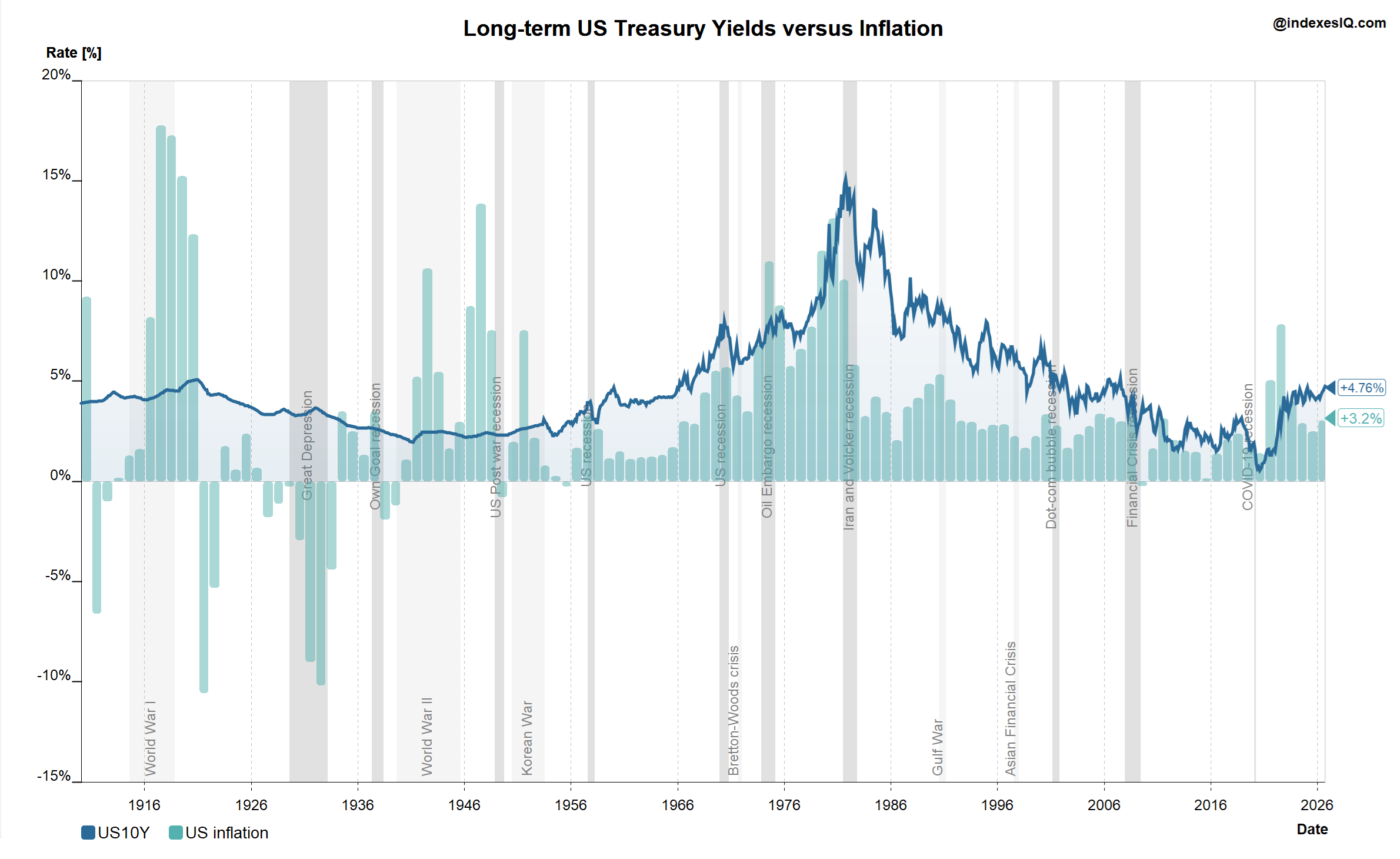
US CPI inflation and 10-year Treasury yield, 1910 to end of August 2026. The WW II trough, the Volcker peak and the four-decade decline are clearly visible. Source: IndexesIQ.
The yield tide has run in two enormous multi-decade waves. The first was a long rise: US 10-year yields troughed at just below 2% in early 1941, suppressed by wartime financing. What followed was a four-decade upward tide, reaching its peak on 26 September 1981 at 15.84% — when Fed Chair Paul Volcker broke inflation's back.
The second wave was a long fall. From that 1981 peak, a four-decade decline in yields created extraordinary wealth for bond investors. By 2020, the 10-year had fallen below 0.5%. That four-decade period of falling rates is now behind us. The question is what comes next.
The Bond King — and Why He Got It Wrong (Then Right)
The man who best exploited the long falling tide was Bill Gross, founder of PIMCO and widely known as the "Bond King." In early 2011, convinced that the end of QE2 would cause yields to spike, PIMCO's Total Return Fund cut its Treasury exposure to zero. Instead yields plunged — the fund trailed 84% of its peers that year. Gross admitted it was a "mistake." A similar bet against German Bunds in 2015 also backfired.
Yet in late 2023, Gross correctly anticipated that structural inflation and ballooning deficits would keep the 10-year yield elevated near 4.5% to 5%. He called the direction correctly — he was just a decade early.
Ferguson's Law and the Fiscal Reckoning
In February 2025, historian Sir Niall Ferguson published "Ferguson's Law: Debt Service, Military Spending, and the Fiscal Limits of Power" — named after Adam Ferguson (1723–1816), the Scottish political theorist who warned of excessive indebtedness.
"Any great power that spends more on servicing its debt than on defense risks ceasing to be a great power."
The US crossed the Ferguson limit for the first time in nearly a century in 2024: defence spending 2.9% of GDP, net interest payments 3.1% of GDP. With gross federal debt approaching $40 trillion and rising at roughly $7.7 billion per day, interest payments are on an upward trajectory that will be difficult to reverse without significant structural reforms.
Three Structural Reasons for Higher Rates for Longer
1. The tailwinds that drove low rates have disappeared. Globalisation suppressed goods prices for two decades. QE directly pushed down yields. Both have largely run their course.
2. The US may be entering a vicious fiscal cycle.
The US Fiscal Vicious Cycle
Illustrative. Self-reinforcing as long as growth does not outpace debt accumulation. Source: IndexesIQ.
3. The AI debt deluge is competing with Treasuries for investor capital. The five major AI hyperscalers averaged just $28 billion per year in US corporate bond issuance between 2020 and 2024. In 2025 that jumped to $121 billion. By late July 2026, cumulative 2026 issuance had already reached approximately $220 billion. As we explored in Insight #5, the scale of AI infrastructure investment is extraordinary — and financing it competes directly with Treasuries for investor attention, pushing up the term premium.
The Debt/GDP Spiral
Chart 2: US Federal Debt as % of GDP and Historical GDP Growth Rates, 1961–August 2026
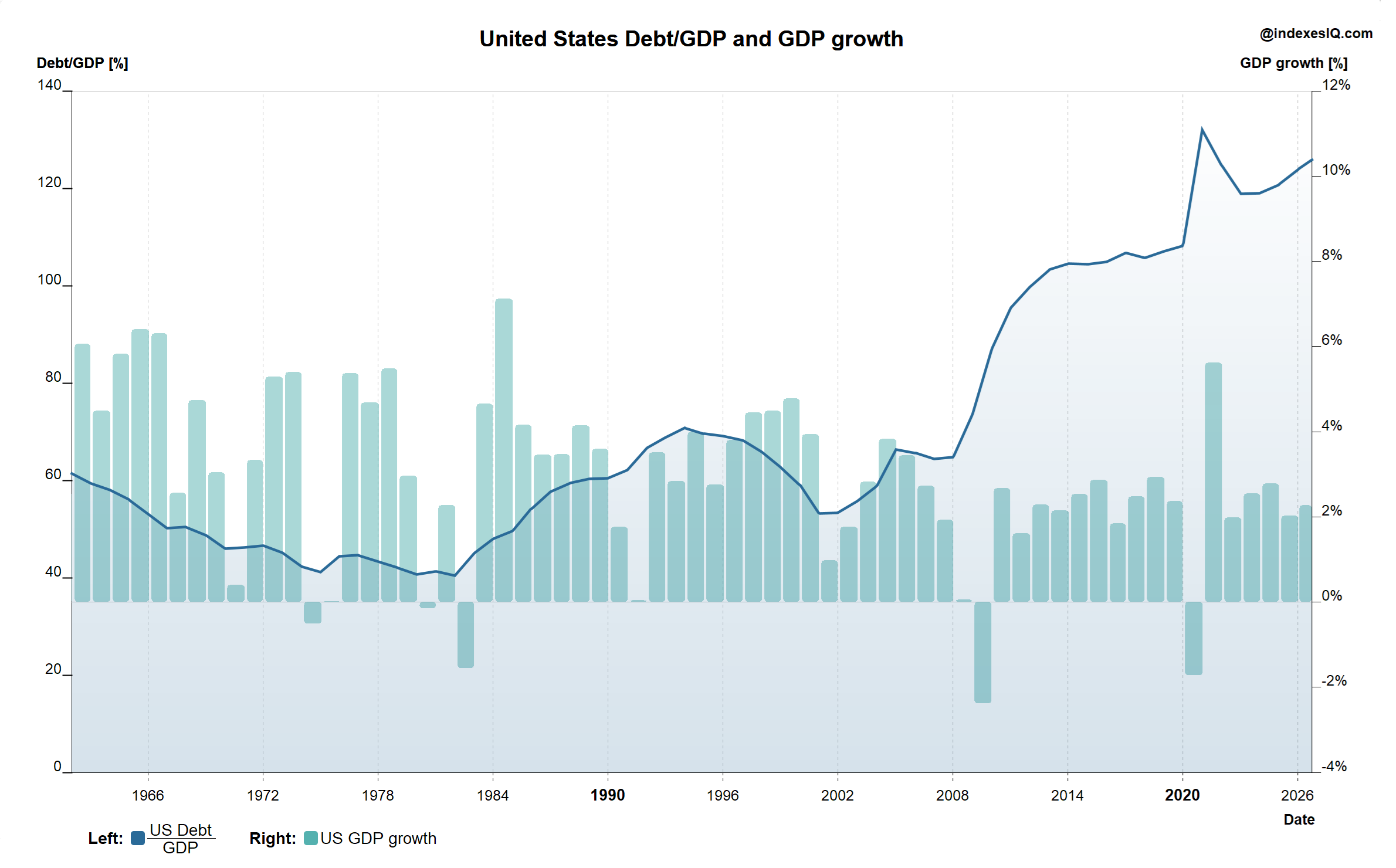
US federal debt as % of GDP and annualised GDP growth, 1961 to end of August 2026. During the strong growth of the 1990s, debt/GDP fell well below 60%. Today it exceeds 120%. Source: IndexesIQ.
During the strong growth years of the 1990s, debt-to-GDP fell below 60%. Today it exceeds 120%. These dynamics can compound into an interest rate spiral:
The Interest Rate Spiral
Illustrative self-reinforcing feedback loop. Each step increases pressure on the next. Source: IndexesIQ.
Who Holds US Treasuries — and Are They Still Buying?
Total foreign holdings of US Treasuries stood at $9.29 trillion as of June 2026, up 2.3% annually — a modest headline that masks significant divergence between individual holders.
| # | Country | Holdings ($bn, Jun 2026) | Annual Change |
|---|---|---|---|
| 1 |  Japan Japan | 1,116.7 | −3.3% |
| 2 |  United Kingdom United Kingdom | 939.9 | +9.8% |
| 3 |  China China | 633.4 | −13.4% |
| 4 |  Belgium Belgium | 482.5 | +12.1% |
| 5 |  Canada Canada | 459.6 | +4.7% |
| 6 |  Cayman Islands Cayman Islands | 453.1 | +2.7% |
| 7 |  Luxembourg Luxembourg | 434.2 | +7.6% |
| 8 |  France France | 389.9 | +4.3% |
| 9 |  Ireland Ireland | 353.5 | +13.9% |
| 10 |  Taiwan Taiwan | 302.5 | −1.5% |
| 11 |  Switzerland Switzerland | 284.9 | −5.2% |
| 12 |  Singapore Singapore | 284.4 | +12.1% |
| 13 |  Hong Kong Hong Kong | 255.8 | +5.7% |
| 14 |  Norway Norway | 203.2 | +4.1% |
| 15 |  India India | 186.4 | −18.0% |
| 16 |  Brazil Brazil | 168.4 | −21.8% |
| 17 |  Saudi Arabia Saudi Arabia | 142.5 | +9.2% |
| 18 |  South Korea South Korea | 134.7 | +6.4% |
| 19 |  UAE UAE | 114.8 | +19.0% |
| 20 |  Israel Israel | 110.9 | +8.9% |
Source: US Treasury TIC data, June 2026 (released 17 August 2026). Total foreign holdings = $9.29 trillion, +2.3% annually.
The two largest holders — Japan (−3.3%) and China (−13.4%) — are both reducing their Treasury positions. Together they hold nearly $1.75 trillion. India (−18.0%) and Brazil (−21.8%) are also notable sellers. The implication is clear: if the two largest foreign creditors are reducing exposure, the US Treasury will need to offer more attractive yields to place future debt — adding further upward pressure to the rate spiral.
The four-decade tide of falling US Treasury yields is over. Three structural forces point to higher rates for longer: the disinflationary tailwinds of globalisation and QE have faded; the US may be entering a vicious fiscal cycle where deficits drive inflation, which drives tighter policy, which drives higher debt costs; and the AI infrastructure buildout is generating unprecedented corporate bond supply — over $220 billion from the Big Five hyperscalers in 2026 alone — that competes with Treasuries for investor capital. Ferguson's Law was crossed by the US for the first time in nearly a century in 2024. Meanwhile, Japan and China — the two largest foreign creditors — are reducing their Treasury holdings, requiring higher yields to attract future buyers. Bill Gross called the long-term direction correctly — he was just a decade early. The tide has now turned.
Part 2 of 2
Treasuries — The Global View
Having seen how the tide has turned in US yields, we now widen the lens to Western developed markets. Is the United States an outlier — or the leading edge of a much broader shift in global government bond markets? Germany, France, the UK, Australia and Canada are, alongside the US and Japan, among the largest sovereign debt markets in the world — for a full ranking, see our IndexesIQ Academy primer on Government Bond Markets — US Treasuries, Bunds, Gilts & JGBs.
Chart 3: 10-Year Treasury Yields — Germany, France, UK, Australia and Canada, and OECD Inflation, July 1984–August 2026
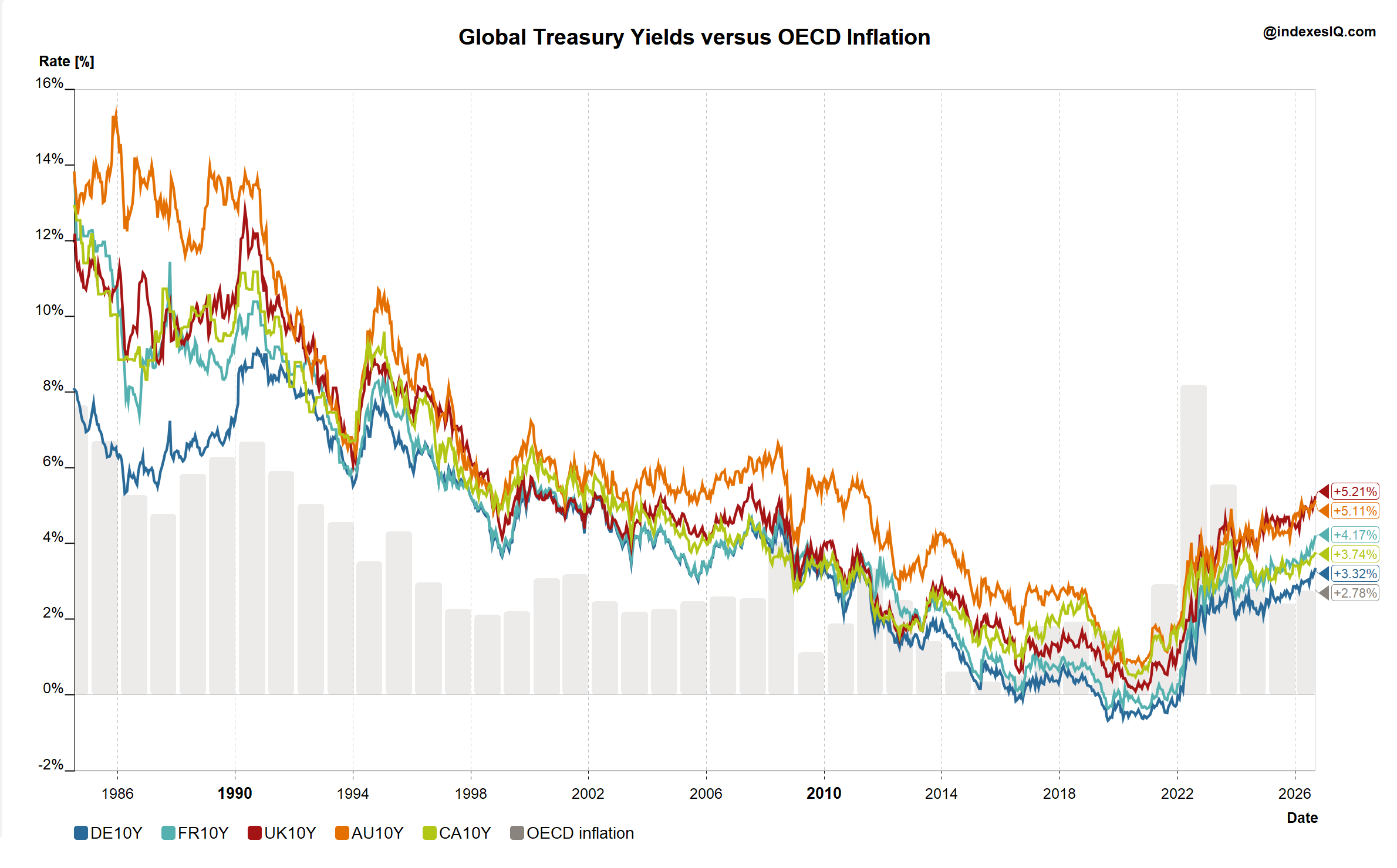
10-year government bond yields for Germany, France, the UK, Australia and Canada, alongside the OECD inflation rate (covering both developed and developing member economies), July 1984 to end of August 2026. Source: IndexesIQ.
The trend in Chart 3 is unmistakable: the era of low inflation is over, and treasury yields are picking up right across the developed world. German Bunds closed August at 3.32% and UK gilts at 5.21% — both a long way from the near-zero and negative yields that prevailed for much of the 2010s.
What is striking is not just the direction, but the long-run synchronisation of the rate cycle across these economies. Germany, France, the UK, Australia and Canada have moved through broadly the same multi-decade disinflationary wave as the US — and are now riding the same reversal. The economic logic is straightforward. These economies are deeply integrated into the same global trading and financial system: they imported the same disinflationary forces from globalisation and cheap Asian manufacturing in the 1990s and 2000s, they were exposed to the same global shocks (the 2008 financial crisis, the Covid pandemic, the 2022 energy and inflation spike), and their central banks largely follow the same rate-setting playbook — inflation targeting, calibrated in no small part by watching what the Federal Reserve does, since US monetary policy sets the tone for global financial conditions through the dollar's role as the world's reserve and funding currency. When one major central bank tightens or eases, capital flows and exchange rate pressures tend to pull the others along the same path.
Short-Term Correlations Have Risen Too
Chart 4: Rolling Price Correlation of Bunds, Gilts, Australian and Canadian Treasuries to US 10-Year Treasuries, August 1985–August 2026
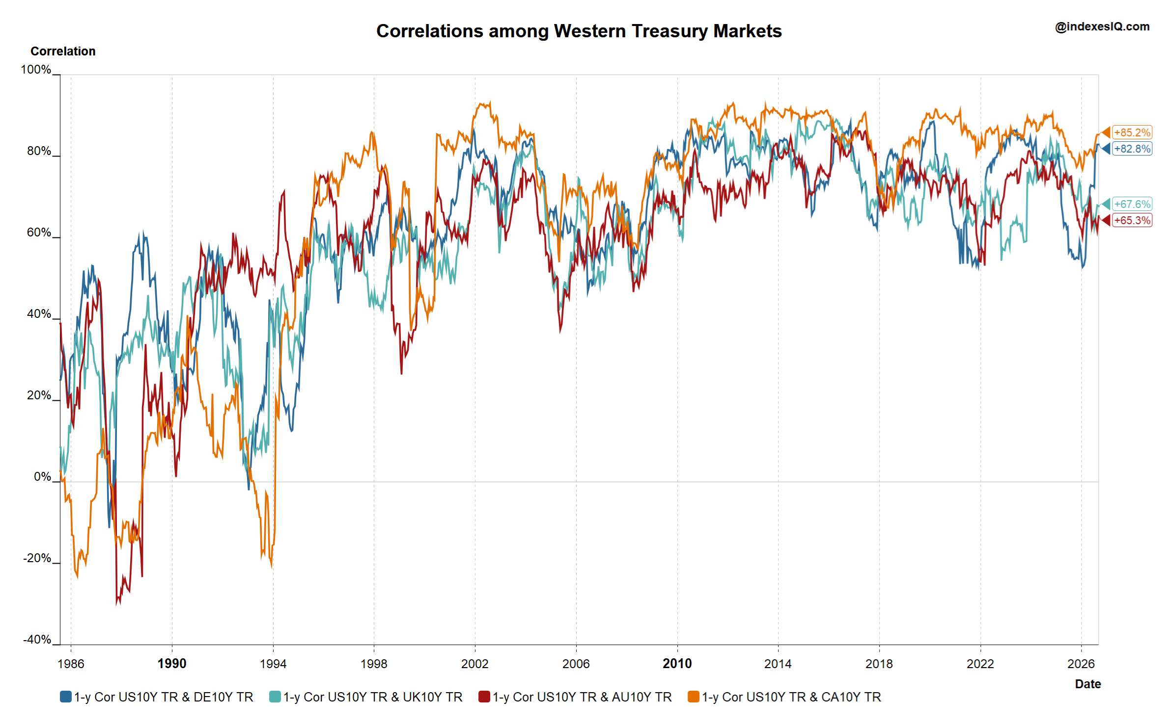
Rolling price correlation of the 10-year German, UK, Australian and Canadian total return treasury indexes to the US 10-year total return treasury index, August 1985 to end of August 2026, calculated using the methodology described in the technical appendix. Source: IndexesIQ.
It is not just the long-run cycle that has converged — short-term market price correlations have risen too. Chart 4 shows the rolling price correlation of four major developed-market treasury indexes against the US 10-year treasury, and the pattern over the past decade is clear: average correlations have been running well above their levels of 20 or 30 years ago, ranging from 65% for Australia to 85% for Canada.
Three forces explain this rise. First, global capital markets are simply more integrated than they were a generation ago — cross-border ownership of government bonds has grown steadily as capital controls have fallen away and settlement infrastructure has become seamless. Second, the investor base has globalised: pension funds, insurers, sovereign wealth funds and central bank reserve managers now routinely hold diversified baskets of developed-market government bonds rather than concentrating in their home market, and global fixed income benchmarks and ETFs mean that a flow into or out of "developed market duration" moves several countries' yields simultaneously. Third, macro and algorithmic trading strategies increasingly treat G7 government bonds as a single, highly substitutable asset class, arbitraging away small pricing differences and mechanically tightening the correlation between them.
Treasury markets that move together, and that share the same cyclical drivers, offer less diversification than investors might assume. For long-term global bond investors, this rising co-movement is itself a source of risk — and a growing incentive to look beyond government bonds alone for genuine diversification.
The Other Driver of Risk: Debt and the Vicious Cycle
Chart 5: General Government Debt as % of GDP — Germany, France, Italy, UK, Australia and Canada
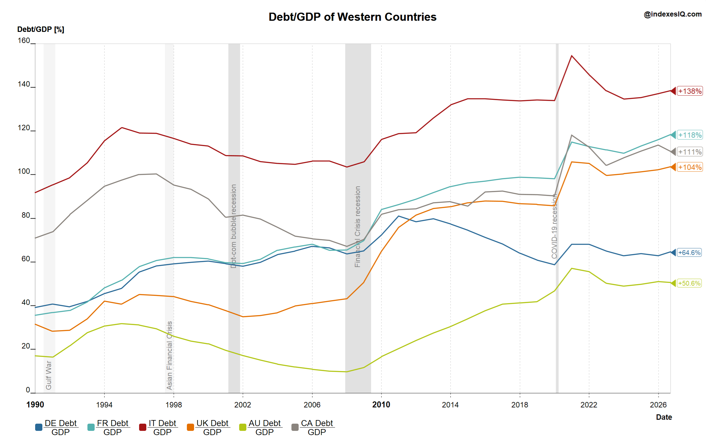
General government debt as % of GDP, Germany, France, Italy, UK, Australia and Canada. Source: IndexesIQ.
A second driver of risk sits alongside rising and increasingly correlated yields: high and, in several cases, rapidly rising debt-to-GDP ratios — the legacy of the low-rate era combined with the fiscal cost of the financial crisis and the Covid pandemic, both of which are clearly visible in Chart 5 as step-changes higher in every country shown.
Italy remains the most indebted of the group at just over 130% of GDP — though it is one of the few to be moving in the right direction, having begun reducing its ratio through sustained fiscal austerity. France is close behind at nearly 120% and rising rapidly, driven by persistent fiscal deficits rather than any deliberate consolidation. Canada sits around 110%. The UK has crossed the 100% threshold and continues to climb. Germany is the exception: its debt ratio has fallen steadily over the past 15 years, the legacy of its constitutional "Schuldenbremse" (debt brake). That trajectory, however, is set to change — Germany's new policies on rearmament and the renewal of its ageing infrastructure will require substantially more borrowing in the years ahead. Australia looks modest by comparison, at around 50% of GDP and moving broadly sideways.
Applying Ferguson's Law Beyond the US
In Part 1 we introduced Ferguson's Law: the observation that any great power spending more on servicing its debt than on defence risks ceasing to be a great power. None of the countries in this comparison would currently qualify as a "superpower" in Ferguson's original sense — but the underlying mechanism still applies, for two reasons. First, comparing the annual interest bill to military spending is a clean way of exposing the real fiscal constraints a government is operating under. Second, European — and especially NATO — countries are now in a phase of structurally rising military spending, for reasons that need little explanation, which will collide directly with already-stretched budgets.
Table 1: Estimated 2026 Interest Payments, Defence Spending and Fiscal Deficit (% of GDP), and Future Defence Spending Targets
| Country | Interest payments (% GDP) | Defence spending (% GDP) | Fiscal deficit (% GDP) | Future defence spending target |
|---|---|---|---|---|
 Germany Germany | ~1.6% | ~2.7% | 4.75% | NATO 5% by 2035; core spending already set to reach ~3.5% by 2029 |
| France | ~3.0% | 2.05% | 4.7% | NATO 5% by 2035; national ambition of ~3.5% core |
 Italy Italy | 4.6% | 2.01% | 2.8% | NATO 5% by 2035 (flexible timetable); doubling to 3% within four years |
| United Kingdom | ~3.8% | 2.4% | 4.5% | 2.5% by 2027, ambition of 3% by 2034; NATO 5% by 2035 |
| Canada | ~3.2% | 2.01% | ~2.5% | NATO 5% by 2035 (signed the Hague pledge) |
 Australia Australia | ~1.4% | 2.02%* | ~1.0% | 3% of GDP by early 2030s (national target; not a NATO member) |
Interest payments and deficit figures per IMF Fiscal Monitor (Apr 2026), OECD Economic Outlook (2026), European Commission forecasts and national budget documents; figures marked "~" are IndexesIQ estimates derived from published debt levels and prevailing yields where no official 2026 figure was available. Defence spending on NATO-comparable definition (2025, latest available); *Australia's defence spending is 2.02% on national accounting, or approximately 2.8% under NATO-comparable methodology. All five NATO members shown committed at the June 2025 Hague summit to invest 5% of GDP annually by 2035 — 3.5% on core defence, 1.5% on broader security and resilience spending — alongside their own nearer-term national targets shown here.
The message is clear: Western countries broadly — not only the US — are at risk of sliding into the same vicious cycle of high debt, rising interest costs and shrinking fiscal room, just as the demands on their budgets from defence spending are increasing.
Global Asset Owners Are Already Reacting
We noted in Part 1 that Japan and China have been reducing their US Treasury holdings. That reallocation away from perceived "safe" government debt is not confined to the US market. Bond investors have also been rotating within Europe: yields on French government debt have risen to the point that France now borrows more expensively than Italy — a reversal of the historical hierarchy between the two. As the Financial Times put it, quoting Mizuho's Evelyne Gomez-Liechti (reported via Ansa's English wire service, as the original FT article is paywalled): "France is the new Italy." Italy is running a primary surplus and has been reducing its debt ratio; France is running a fiscal deficit that increasingly looks, in the words of one strategist, "out of control." Bond investors have responded by rotating out of French debt and into Italian debt — even though Italy's headline debt level remains higher.
Sovereign wealth funds are reacting too. In September 2026, Norges Bank Investment Management — manager of Norway's roughly $2.3 trillion sovereign wealth fund, the world's largest — proposed a significant overhaul of its bond portfolio, recommending that the government-bond weighting in its benchmark fall from 70% to 50%, with US Treasuries taking the largest cut: from 34.1% to 21.9% of the bond index. That would mean reducing the fund's roughly $215 billion in US Treasury holdings by an estimated $80 billion, reinvested instead into a more diversified mix that includes non-government debt such as mortgage-backed securities. Full details of the proposal were reported by CNBC.
When risks are hard to gauge or predict precisely, diversifying away from them is a strategy that can be applied even without knowing exactly how or when they will materialise — and that is precisely the logic now driving some of the world's largest holders of government debt.
The tide has turned globally, not just in the US: the era of low inflation and very low yields appears to be over across Western developed markets, with German Bunds at 3.32% and UK gilts at 5.21% by the end of August. Treasury markets have long shared a common long-run rate cycle, but short-term price correlations have risen too — from 65% (Australia) to 85% (Canada) against US Treasuries over the past decade — leaving global bond investors with less diversification than they might assume. A legacy of the low-yield era, compounded by the financial crisis and the Covid years, is high government debt — Italy above 130%, France near 120% and rising, Canada around 110%, the UK above 100% — and shrinking fiscal room, made worse by the need for higher military spending across NATO. Asset owners are already responding: European bond investors are rotating from French into Italian debt, and Norges Bank has proposed cutting its Treasury allocation by an estimated $80 billion. When risk is hard to gauge, diversification remains the most reliable response.