
proverb
"Money grows on the tree of persistence."
Japanese Proverb
On patience, resilience — and long-term investing
Big in Japan, Again?
For anyone going to school in the 1980s, the song Big in Japan by Alphaville captured something real about the era. Japan was the economic superpower of the decade. Sony, Toyota, Hitachi — Japanese technology companies were the masters of the universe. Japanese corporations were waging a chip war on America. The Nikkei 225 was defying all rules of gravity. My teacher told me: "You have to learn Japanese to have a future in business."
It all came differently. The bubble burst spectacularly at the turn of the decade, ushering in what became known as Japan's Lost Generation — three decades of economic stagnation, deflation and equity market underperformance that became a cautionary tale for investors and central bankers alike.
But now, looking at recent developments — the dramatic rise of the Nikkei, and Japan's re-emergence as a key node in the global AI supply chain (explored in detail in Insight #5) — the song Big in Japan is taking on a new meaning. Interestingly, the songwriter's original intention was not about Japan's economic dominance at all: the lyric was meant to express that even someone in a difficult situation in life can find their moment — that change is possible, and you too may be big in Japan. After a lost generation of returns, that is now the question for investors: is Japan back — as an economy, and as an investment universe?
We take a closer look at this question in this month's series.
This four-part series asks a single question from four different angles: after one of the longest recoveries in financial market history, is Japan genuinely back — as an economy, and as an investment universe? We start with the Nikkei's full history and what it actually meant for local versus international investors. We then run a 70-year thought experiment comparing Japanese and American equities in dollar terms, before turning to what global benchmark investors can learn about diversifying long technology cycles. We close with the other side of Japan's story: its sovereign debt and the interest rate dilemma facing the Bank of Japan.
In this series:
- Is Japan back? — The Nikkei's full history and what the numbers say for local vs international investors
- Who won over 70 years? — Einstein's twin brothers and the surprising USD comparison of Nikkei vs S&P 500
- How to diversify long tech cycles? — The sister's 50:50 portfolio and the Cambridge Associates decade table
- Is Japan still an economic exception? — The interest rate dilemma and the widow-maker trade
You can read the series in order, or jump straight to the part that interests you most.
Part 1 of 4
The Nikkei 225 — A Tale of Two Eras
Chart 1: Nikkei 225 Full History — May 1949 to July 2026 (JPY)
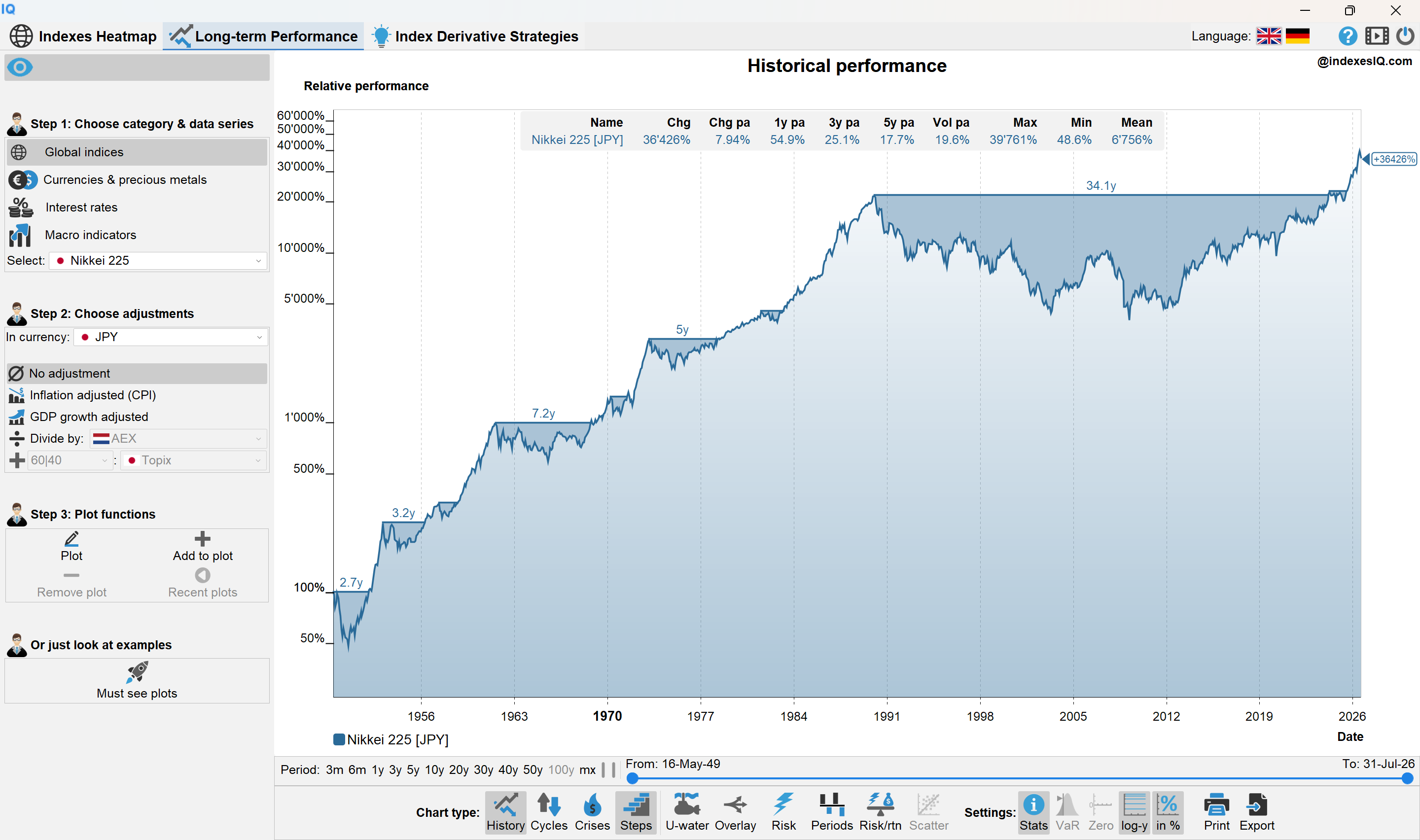
Nikkei 225 full history — from 16 May 1949 (official back-calculation start) to end of July 2026, in JPY. Source: IndexesIQ.
Chart 1 tells one of the most dramatic stories in financial market history. The Nikkei 225's official data begins on 16 May 1949 — though the index was formally launched in September 1950 — and what follows is a chart of two very distinct eras separated by a single catastrophic event: the bursting of Japan's asset price bubble at the end of 1989.
The first era, from 1949 to the peak on 29 December 1989, is one of the most extraordinary equity market runs ever recorded. Driven by Japan's post-war reconstruction, its export-led industrial miracle and the explosive growth of its technology and automotive sectors, the Nikkei rose from a base of ¥176 to an all-time high of 38,957 — a gain of over 22,000% in four decades.
The second era is the story of recovery. From that peak, the Nikkei lost nearly 80% of its value over the following 13 years. The recovery that followed was painfully slow — it took 34.1 years in nominal JPY terms for the index to reclaim its 1989 peak, finally doing so in early 2024. Adjusted for inflation, the recovery stretches to just over 35 years — one of the longest drawdown recoveries ever recorded in a major equity market.
Yet zoom out to the full picture and the long-run numbers are less grim than the bubble narrative suggests. Across the entire period from 1949 to July 2026, the Nikkei has delivered an average annual return of approximately 8% per year in JPY — a respectable long-run figure, albeit with cycles of extraordinary volatility that would have tested the resolve of any investor.
Most strikingly, the last three years have seen an average annual return of +25.1% in JPY — a pace of appreciation that has drawn global attention back to Japanese equities and prompted a growing number of investment analysts to revisit Japan as an opportunity.
The Long Shadow of the Bubble — What International Investors Actually Earned
Chart 2: Nikkei 225 from Peak (December 1989) to July 2026 — JPY, USD and DEM/EUR, Nominal and Inflation-Adjusted
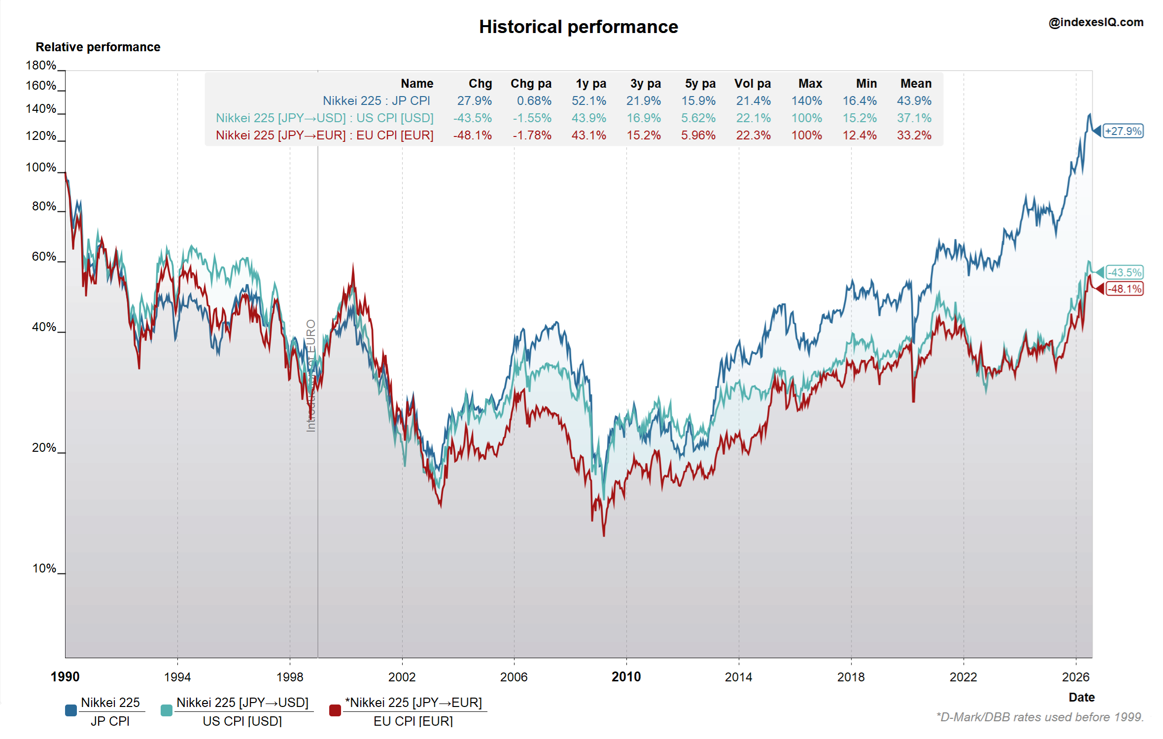
Nikkei 225 from the bubble peak (end of December 1989) to end of July 2026 — in JPY, USD and DEM/EUR, nominal and inflation-adjusted. DEM rates used before euro introduction. Source: IndexesIQ.
The JPY numbers tell one story. The story for international investors — American, European or otherwise — is considerably more sobering, and it illustrates a principle we have explored in Insight #1 and Insight #3: nominal local-currency returns are only part of the picture. For a fair long-term comparison, you must adjust for inflation in your home currency — and for international investors, you must also account for currency movements. This is exactly the kind of multi-currency, inflation-adjusted analysis that the free IndexesIQ browser app and Windows desktop app are built to run.
Chart 2 runs the Nikkei from the bubble peak at end of December 1989 to end of July 2026 across three investor perspectives.
For the Japanese investor in JPY, the picture — while painful for decades — has at least turned positive. In inflation-adjusted JPY terms, the Nikkei is now up approximately +28% from its 1989 peak. A meagre 36-year return by any standard, but at least positive — the Japanese investor who held through the entire cycle has finally, barely, recovered their real purchasing power.
For the American investor in USD, the picture is dramatically worse. The combination of the Nikkei's long underperformance and the significant weakening of the Japanese yen against the dollar means that the USD-adjusted, inflation-adjusted return from the 1989 peak to July 2026 is approximately −44%. An American investor who bought Japanese equities at the peak of the bubble has lost nearly half their real purchasing power — 36 years later.
For the European investor in DEM/EUR — using Deutsche Mark rates before the euro's introduction in 1999 to reflect the experience of a German investor — the outcome is even starker: approximately −48% in real EUR terms. The euro's relative strength against the yen over this period has compounded the losses further.
The yen's long-term weakness against both the dollar and the euro is the critical variable that turns Japan's domestic recovery story into an international loss story. As we noted in Insight #6, even the Nikkei's recent surge of +25% per year in local terms was significantly offset for USD and EUR investors by yen weakness. Currency risk is not a side note to Japan's investment story — it is central to it.
So Is Japan Back?
The domestic equity recovery is real. The recent performance is remarkable. Japan's role in the AI supply chain — through companies like Tokyo Electron, Advantest and Shin-Etsu Chemical — is genuine and growing. Investment analysts are right to pay attention.
But for international investors, the shadow of the 1989 bubble has not yet fully lifted. In real USD and EUR terms, those who measure from the peak are still deeply underwater. The question is whether the current cycle — driven by structural reforms, corporate governance improvements, the AI boom and a potential shift in Bank of Japan policy — represents a genuine new chapter, or another false dawn.
Japan is a big and complex topic. To be continued.
The Nikkei's full history is a story of extraordinary rise, catastrophic fall and painfully slow recovery — 34.1 years in nominal JPY, over 35 years in real terms. Long-run JPY returns are a solid ~8% per year, and the last three years at +25.1% have reignited global interest in Japan. But for international investors, the picture is far less encouraging: still down ~44% in real USD and ~48% in real EUR from the 1989 peak. Currency is the decisive factor. Japan may well be back — but the full answer requires looking well beyond the local headline numbers. More to follow.
Jump to: Part 1 · Part 2 · Part 3 · Part 4
Part 2 of 4
Einstein's Twin Paradox in Finance
Einstein's famous thought experiment of two twin brothers — one staying on Earth, one travelling through space at near the speed of light — became one of the most celebrated illustrations in physics. Time, Einstein showed, does not run at the same speed for all observers. The travelling twin returns younger than the one who stayed behind.
In finance, time is also money. And as we know, the clock of money can tick at very different speeds depending on where you invest. As a follow-up to our introductory look at Japan's long economic cycle, let us try a thought experiment of our own.
Imagine that 70 years ago, at the beginning of 1956, Einstein's twin brothers were both young teenagers, each with $100 to invest. The first brother invests his money into a low-fee S&P 500 index tracker. The second brother converts his $100 into yen — at the prevailing Bretton Woods fixed rate of ¥360 per dollar — and invests in a Nikkei 225 tracker.
The question, 70.5 years later in July 2026, is simple: whose investment has gained more value in USD?
Take a moment before reading on — what is your spontaneous answer?
The Answer May Surprise You
Chart 3: Nikkei 225 vs S&P 500 — Local Currency and USD Ratio, January 1956 to July 2026
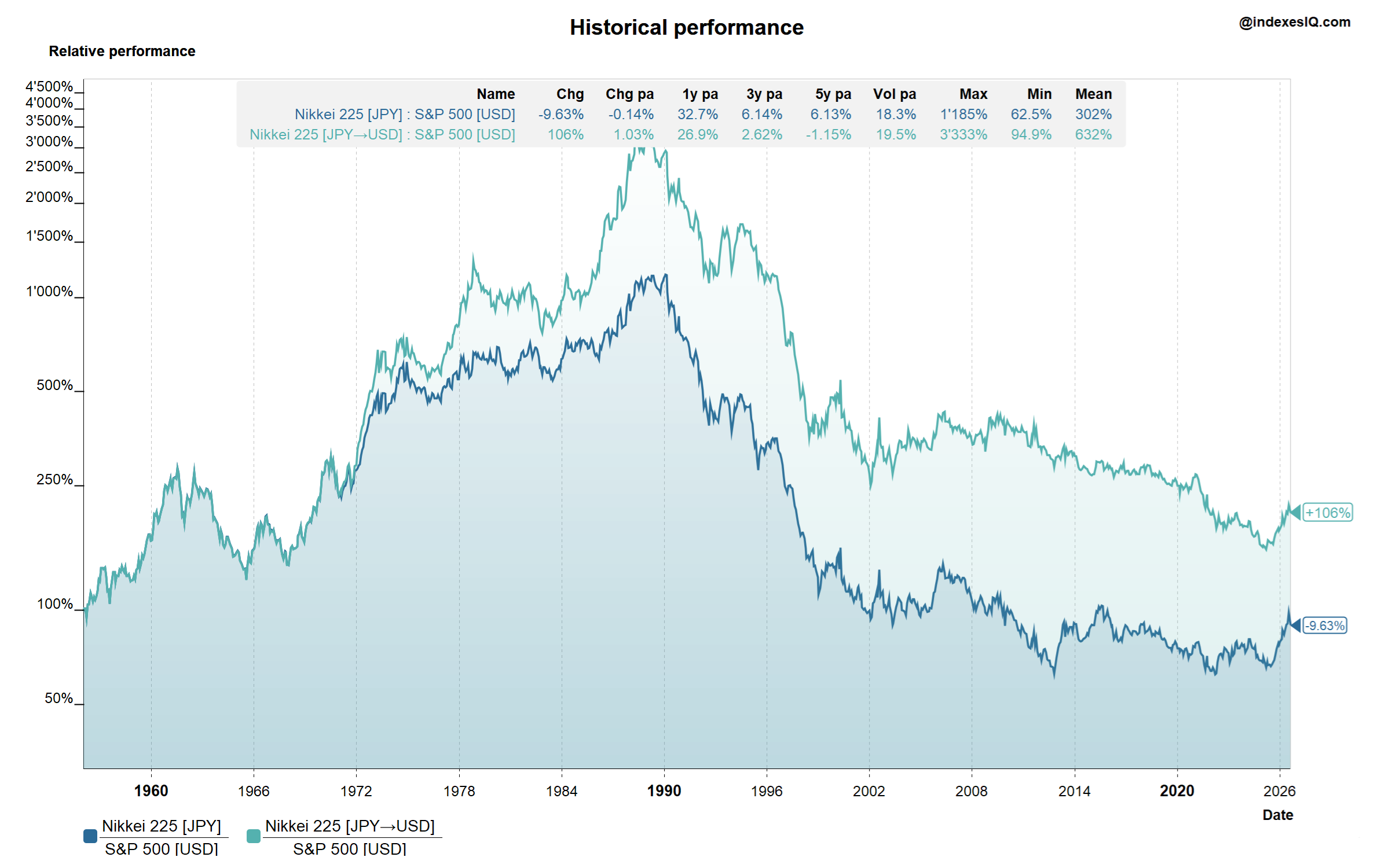
Ratio of Nikkei 225 vs S&P 500 — in local currency (JPY vs USD) and in USD terms, January 1956 to July 2026. A value above 100% means the Nikkei is ahead. Source: IndexesIQ.
In local currency terms, the two price indexes have had a remarkably similar cumulative performance over 70 years — with the Nikkei finishing approximately 10% behind the S&P 500. Given how different the two economies and their histories have been, this is itself a striking result.
But in USD terms, the Nikkei brother comes out the winner — ahead by approximately +106%. The second brother, despite investing in an index that slightly underperformed in local currency, ends up with roughly twice as much wealth in dollar terms.
The driver of this reversal is entirely the exchange rate. The yen was fixed at ¥360 per dollar under the Bretton Woods system. Today it trades at around ¥155–160 per dollar. That means the yen has more than doubled in value against the dollar over the study period — a structural currency tailwind of enormous magnitude that has more than compensated for the modest local-currency underperformance.
Chart 3 also reveals how dramatically different the journey was. By the end of 1989, the Nikkei was over 1,000% ahead of the S&P 500 in local currency terms — and almost 4,000% ahead in USD terms, as the yen had also appreciated sharply following the 1985 Plaza Accord. Then the bubble burst, and over the following three decades the S&P 500 steadily clawed back the deficit. The two lines have been converging ever since — but the USD advantage for the Nikkei brother has never fully disappeared.
The Currency Story: From ¥360 to ¥75 and Back
Chart 4: JPY/USD Exchange Rate — End of Bretton Woods (1971) to July 2026
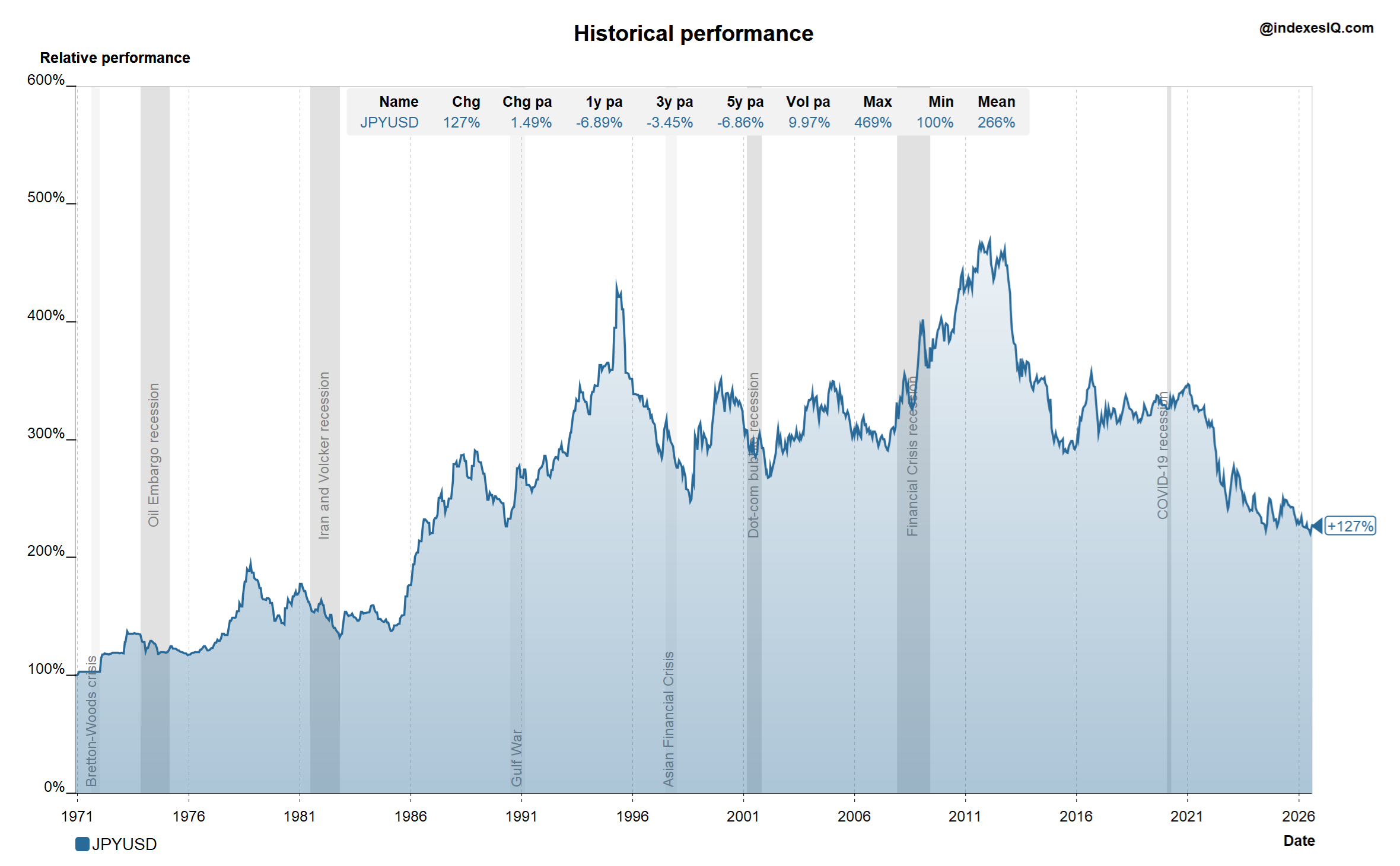
JPY/USD exchange rate from the end of the Bretton Woods system (1971) to end of July 2026. The yen peaked at ¥75.35 per dollar on 31 October 2011 — its strongest level ever. Source: IndexesIQ.
The yen's post-Bretton Woods journey is one of the great currency stories in financial history. Fixed at ¥360 per dollar until 1971, it then began a decades-long appreciation — accelerated by the 1985 Plaza Accord, when major governments deliberately drove the dollar lower. The yen reached its all-time strongest level on 31 October 2011, trading at just ¥75.35 per dollar — meaning a dollar that bought 360 yen in 1970 bought fewer than 76 in 2011.
Since then, the yen has weakened significantly during Japan's ultra-low interest rate era, falling back to ¥155–163 by mid-2026. Yet even at today's levels, the yen remains more than twice as strong as it was under the Bretton Woods peg. For our second twin brother, that structural appreciation represents a permanent and substantial boost to his USD-denominated wealth.
What About Dividends?
The analysis above is based on price indexes. The total return picture is more nuanced — and here the first brother begins to recover ground.
The S&P 500 Total Return Index has back-calculated data to 1988, and the Nikkei 225 Total Return Index was officially published in December 2012, back-calculated to December 1979. Neither goes back to 1956, so for our full 70-year period we must work with estimates.
The evidence is clear that the S&P 500 has had a materially higher average dividend yield over the study period. S&P 500 yields averaged 4–5% or more during the 1970s and 1980s, declining to around 1.2% today, with a long-run median of approximately 2.8%. The Nikkei's dividend yield has historically been lower — averaging around 1–1.5% for much of its post-bubble history, only recently rising toward 2%. The gross dividend advantage for the S&P 500 is in the region of 1.2–1.4% per year over the full 70-year period — or roughly ~1% net after taxes.
That ~1% annual dividend advantage closes most of the gap. In annualised USD price return terms, the Nikkei is ahead by approximately 1.03% per year over the 70-year period. Once net dividends are factored in, the two brothers end up with remarkably similar total wealth.
And in Inflation-Adjusted Terms?
As we highlighted in Insight #1 and Insight #3, for long-period comparisons we should always adjust for inflation. In USD inflation-adjusted terms, the Nikkei's price return over the 70-year period is approximately 4.84% per year. Adding the estimated net dividend return of ~1.2% brings the Nikkei brother's estimated real total return to around 6% per year — a very strong result by any historical benchmark.
The S&P 500's inflation-adjusted price return over the same period is somewhat lower — but the higher dividend contribution (approximately 1% more per year net) brings both brothers to a similar destination. Both twins have created comparable real wealth over 70 years.
Two Very Different Journeys to the Same Place
The most important lesson from the twin thought experiment is not the end result — it is the path. The two brothers experienced entirely different investment cycles to arrive at similar destinations.
The first brother made most of his money during the first 30 years, driven by America's post-war boom, the rise of its technology sector and the long bull market of the 1980s and 1990s. The second three decades were choppier — the dot-com crash, the 2008 financial crisis, and a decade of low returns before the AI boom.
The second brother had the opposite experience. His first 30 years were extraordinary — Japan's economic miracle, its technology dominance, the yen's relentless appreciation. Then came the bubble, the lost decades, and a painfully slow recovery. It was only in the last decade, and especially the last few years, that he began to recover strongly.
This tells us something important about technology-driven investment cycles: they can last far longer than anyone expects. Japan's technology dominance in the 1980s felt permanent. So did America's in the 1990s. Both cycles eventually turned. The current AI boom, led once again by the US and now also by Japan's semiconductor supply chain — explored in Insight #5 — is worth watching with the same long-term perspective.
The Simplest Lesson: Diversify
Both brothers would have slept considerably better over the past 70 years had they simply split their $100 fifty-fifty: half into the S&P 500, half into the Nikkei — exactly what their sister does in Part 3 of this series.
The two great technology cycles — Japan's in the 1970s and 1980s, America's in the 1990s and 2000s — would have diversified beautifully. When one brother was riding high, the other was recovering. The combined portfolio would have been far smoother, with similar long-run returns and dramatically lower drawdowns.
In the end, Einstein's twin paradox in finance teaches us the same lesson as it does in physics: the path matters, not just the destination. And in investing, the best way to manage the uncertainty of the path is not to predict which twin will win — but to back both of them.
Diversification does not just protect your wealth. It protects your sleep.
Over 70 years from 1956 to July 2026, the Nikkei 225 and S&P 500 have delivered remarkably similar total returns in USD real terms — despite entirely different journeys. In price terms, the Nikkei is ~106% ahead in USD, thanks to the yen more than doubling against the dollar since the Bretton Woods era. The S&P 500's higher dividend yield (~1% per year net advantage) closes most of that gap. Both brothers end up at a similar destination. But the paths could not have been more different: one made his money in the first 30 years, the other in the second. The lesson for today's AI boom is clear: technology cycles can last decades — and they eventually turn. A 50:50 portfolio of both would have delivered similar returns with far less volatility. Diversification saves you sleepless nights.
Jump to: Part 1 · Part 2 · Part 3 · Part 4
Part 3 of 4
How to Diversify Long Tech Cycles
The twin brothers thought experiment showed us something important: two very different journeys can lead to a similar destination, and a 50:50 portfolio would have smoothed the ride considerably. But what about investors who hold a global benchmark? Surely thousands of stocks across dozens of countries provide all the diversification you need?
Not necessarily — and the reason lies in how global benchmarks are constructed.
Global Benchmarks: Diversified by Stock Count, Not by Cycle
Global benchmarks like the MSCI World, MSCI ACWI and FTSE All-World hold several thousand companies across dozens of countries. They diversify effectively across individual stocks, sectors and regions — removing the idiosyncratic risk of any single company. But they are market-capitalisation weighted, which creates a structural problem: the bigger a market becomes, the more of it you hold. And the bigger a market becomes relative to others, the more likely it is to be expensive.
In a study on the benefits of global diversification, Cambridge Associates illustrated this problem with a striking comparison of MSCI World country weights at the peak of the Japanese bubble in 1989 versus today. The full study is available here: Benefits of Global Diversification — Cambridge Associates. Their analysis shows that equity market leadership has rotated in every decade since the 1950s — and that an equal-weighted, annually rebalanced basket outperformed the US alone in five out of seven decades, finishing in the top half of all countries in five of those seven.
MSCI World Country Weights — 1989 Peak vs July 2026
1989 (Peak)
July 2026
Source: MSCI World, Cambridge Associates. 1989 weights are approximate at the bubble peak. Only top 5 countries shown; remaining weights in "Other".
The message is stark. In 1989, a global investor holding the MSCI World had 44.8% of their portfolio in Japan — just as the bubble was about to burst — and only 29.5% in the US, just as America's great technology bull market was about to begin. Today, the situation has reversed almost perfectly: the US now accounts for 71.7% of the MSCI World, while Japan has shrunk to just 5.6%.
Market-cap weighting systematically overweights the winner of the last cycle and underweights the winner of the next one. It is a feature, not a bug — but it is one that long-term investors should understand.
Which Country Won Each Decade?
Cambridge Associates assembled a striking table showing the best-performing equity markets per decade since the 1950s — measured in excess returns above each country's treasury bill rate in USD, which removes the effect of differing interest rate levels and provides a cleaner like-for-like comparison of equity market performance across countries and time periods. The pattern of rotation is remarkable — and so is the consistent performance of one particular entry: the equal-weighted country basket.
| Rank | 1950s | 1960s | 1970s | 1980s | 1990s | 2000s | 2010s |
|---|---|---|---|---|---|---|---|
| 1 | Japan | Australia | Japan | Sweden | United States | Australia | United States |
| 2 | Germany | Japan | Canada | Japan | Switzerland | Canada | Sweden |
| 3 | France | Canada | Australia | United Kingdom | Sweden | Switzerland | Germany |
| 4 | Italy | Equal-Weighted | United Kingdom | Italy | France | Equal-Weighted | Japan |
| 5 | Equal-Weighted | United States | Equal-Weighted | Equal-Weighted | United Kingdom | Sweden | France |
| 6 | United States | Sweden | Sweden | France | Equal-Weighted | United Kingdom | Switzerland |
| 7 | Australia | Germany | United States | Germany | Germany | France | Equal-Weighted |
| 8 | United Kingdom | United Kingdom | Switzerland | United States | Canada | United States | United Kingdom |
| 9 | Sweden | Switzerland | France | Switzerland | Australia | Germany | Canada |
| 10 | Canada | France | Germany | Australia | Italy | Italy | Australia |
| 11 | Switzerland | Italy | Italy | Canada | Japan | Japan | Australia — Italy |
Source: Cambridge Associates, "Benefits of Global Diversification" (2020), Figure 1. Returns are equity excess returns above each country's treasury bill rate, in USD. Equal-Weighted Basket = annually rebalanced equal-weight allocation across all countries shown.
Two things stand out immediately. First, no single country dominates across decades. Japan tops the 1950s and 1970s, then collapses to last place in the 1990s and 2000s. The US leads the 1990s and 2010s but ranks sixth in the 1950s and seventh in the 1970s. Australia is first in the 1960s and 2000s, then last in the 2010s. The rotation is relentless.
Second, the equal-weighted country basket — annually rebalanced to equal allocation across all 11 markets — never wins a decade outright. But it finishes in the top half in five out of seven decades, and never finishes last. As Cambridge Associates note, it outperformed the US alone in five of the seven decades. Its consistency comes from its structure: by rebalancing annually back to equal weights, it is constantly selling the previous winner and buying the underperformer — a mechanical "buy low, sell high" engine. When cycles turn — as they always eventually do — it is already positioned for the next leader.
There is one important caveat. This rebalancing effect only adds return when cycles turn. During a sustained, long-running bull market in a single country — like the US over the past 15 years — an equal-weighted basket that keeps selling US equities and buying European or Japanese underperformers will add diversification, but at a cost to return. The free lunch of rebalancing requires patience measured in decades.
The Sister's Portfolio: Testing the 50:50 Mix
To put this to the test, let us introduce the twin brothers' sister. Unlike her brothers, she splits her investment equally: 50% Nikkei, 50% S&P 500 — and rebalances regularly to maintain that ratio. This is exactly the kind of constant proportion portfolio that the combine function in the free IndexesIQ app is designed to model.
Chart 5: S&P 500, Nikkei 225 (USD) and 50:50 Rebalanced Mix — January 1956 to July 2026
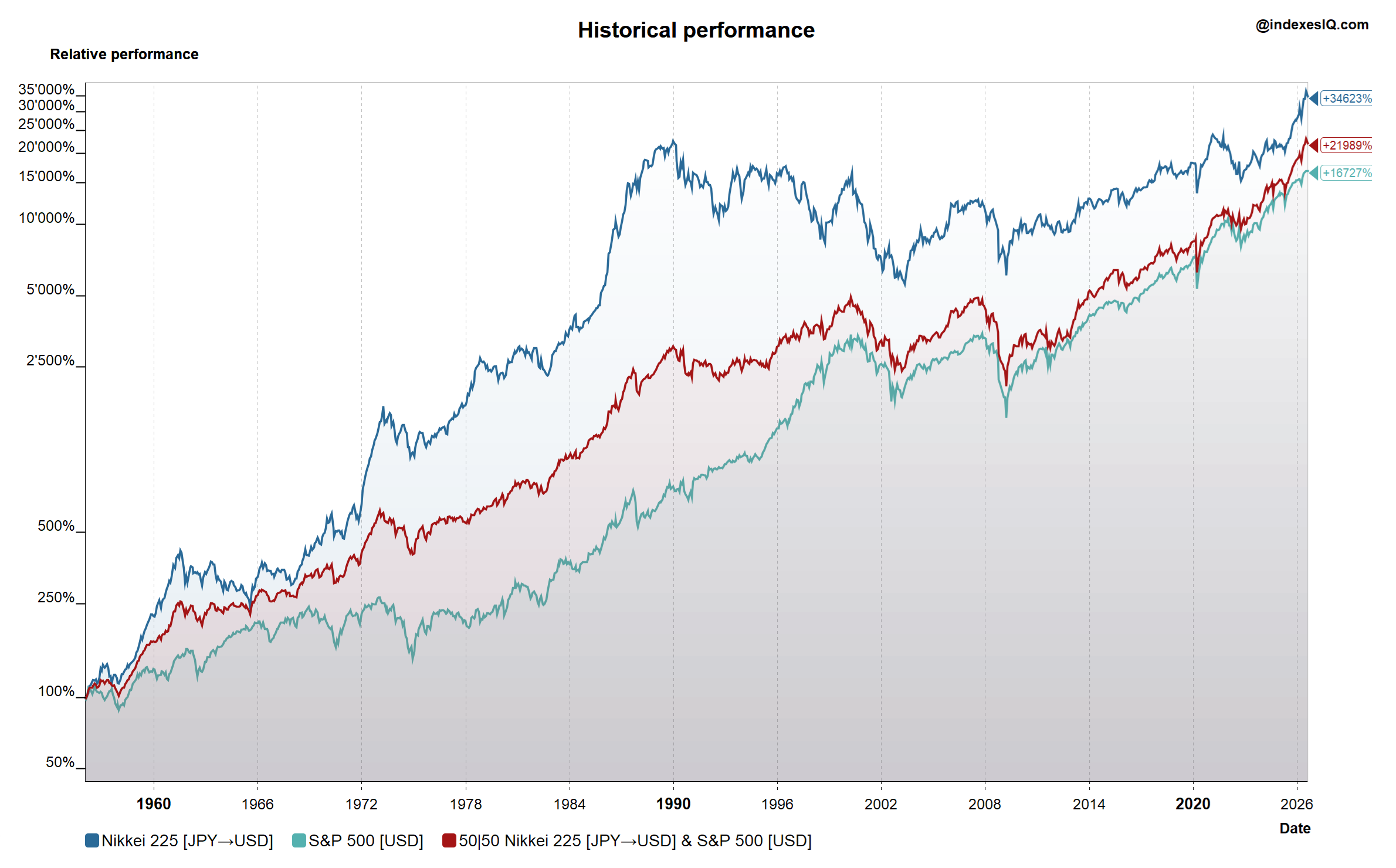
Long-term performance of the S&P 500, Nikkei 225 in USD, and a 50:50 rebalanced mix, January 1956 to July 2026. Source: IndexesIQ.
Unsurprisingly, the sister's 50:50 portfolio sits between the two brothers in terms of cumulative return. But that is not the point. The question is whether it helped with the journey.
Did Diversification Help?
Looking at Volatility
Chart 6: Annualised Volatility vs Return — S&P 500, Nikkei 225 (USD) and 50:50 Mix
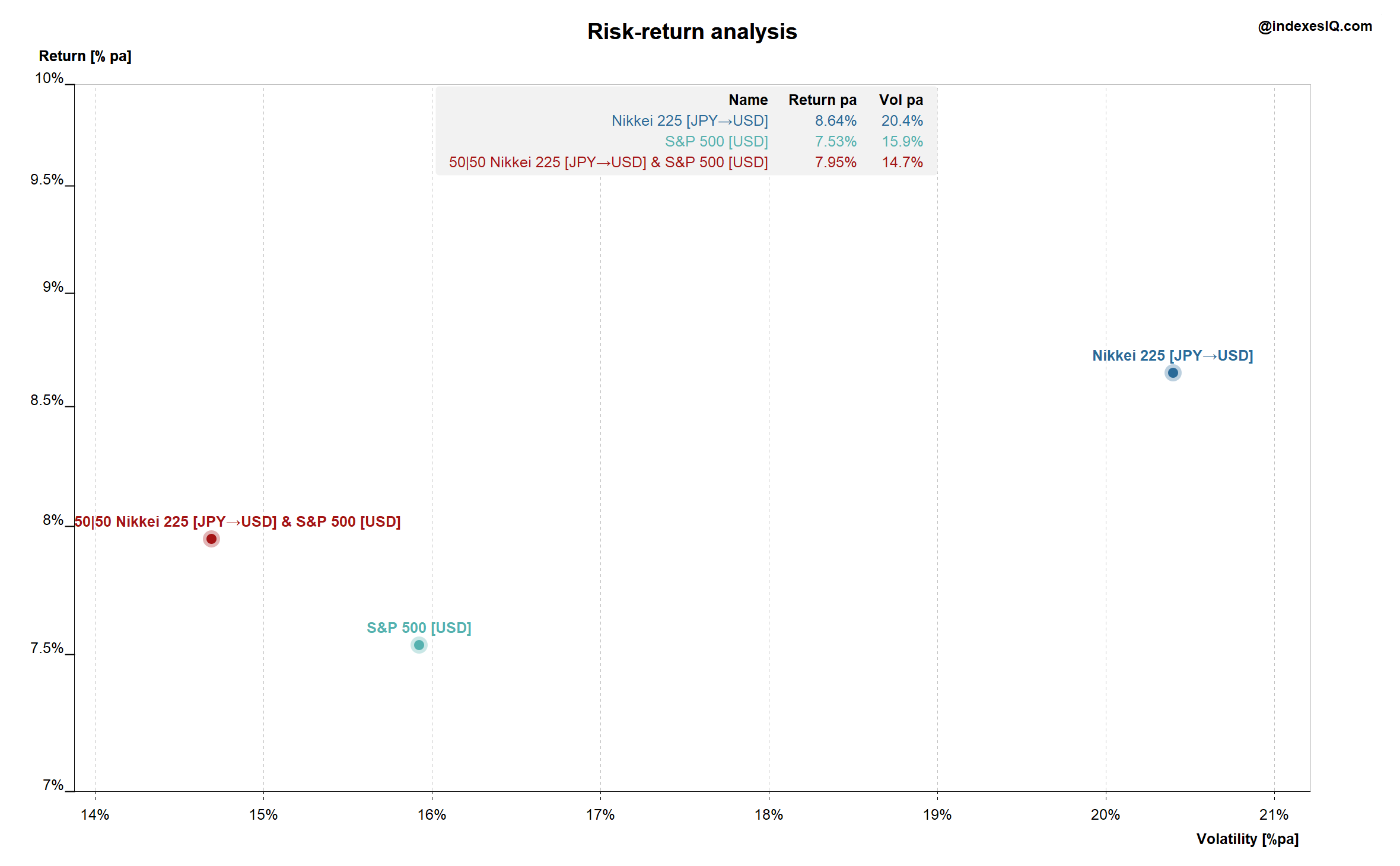
Annualised volatility versus return for the S&P 500, Nikkei 225 in USD and the 50:50 rebalanced mix, January 1956 to July 2026. Source: IndexesIQ.
Chart 6 reveals something striking: the 50:50 mix had the lowest average volatility of the three portfolios — lower even than the S&P 500 alone. This is the textbook benefit of combining two assets with less than perfect correlation. The Nikkei in USD carries both equity risk and currency risk, giving it the highest volatility of the three. But blending it with the S&P 500 reduces the overall variability of the combined portfolio below either component.
Looking at Cyclicality
Chart 7: Decade Returns — S&P 500, Nikkei 225 (USD) and 50:50 Mix, 1956 to July 2026
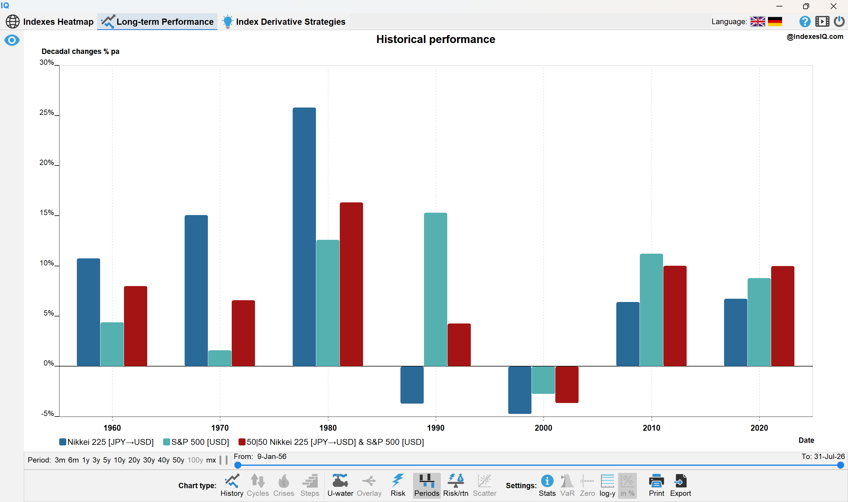
Annual returns per decade for the S&P 500, Nikkei 225 in USD and the 50:50 rebalanced mix, January 1956 to July 2026. Source: IndexesIQ.
Chart 7 answers the deeper question: did the sister sleep better? The answer is clearly yes. The 50:50 portfolio smoothed the two great technology cycles almost perfectly. During Japan's boom decades, the sister captured much of the Nikkei's extraordinary gains while her S&P 500 holding anchored the portfolio. During the US boom of the 1990s and 2010s, the S&P 500 holding drove returns while the Nikkei provided ballast. In the lost decade of the 2000s — difficult for both the US (dot-com crash, financial crisis) and Japan (continued post-bubble stagnation) — the sister fared no worse than either brother.
The Lesson for Today's AI Boom
Global benchmarks like the MSCI World diversify across thousands of stocks — but they do not protect you from long-lasting technology cycles driven by a single country. At the peak of Japan's bubble, a global investor was 45% exposed to a single market. Today, that same investor is over 70% exposed to the United States — and much of that concentration is in a handful of AI-driven technology companies.
This is not a prediction that the US bull market is about to end. As we noted in Insight #6, valuation concerns are real but timing is unknowable. What the data does tell us is that many large asset owners are beginning to ask whether their exposure to US equities — built up over fifteen years of sustained outperformance — has become uncomfortably concentrated. The lesson from the Cambridge Associates table is clear: the country that tops one decade rarely tops the next.
The free IndexesIQ app allows you to sort any index universe by 1-year, 2-year or 10-year performance at any month-end over the past 20 years — the same type of analysis that Cambridge Associates extended back to the 1950s. The rotation pattern is visible in real time.
Global benchmarks diversify stock-specific risk across thousands of companies — but market-cap weighting systematically overweights the winner of the last cycle. In 1989 that meant 45% Japan; today it means over 70% US. The Cambridge Associates decade table shows no country consistently tops the rankings — but an equal-weighted, annually rebalanced basket consistently finishes in the top half by selling the winner and buying the underperformer. The sister's 50:50 Nikkei/S&P 500 portfolio had lower volatility than either index alone and smoothed both great technology cycles beautifully. Diversification does not guarantee higher returns — but it consistently delivers a better night's sleep, and over long periods that matters more than most investors realise.
Jump to: Part 1 · Part 2 · Part 3 · Part 4
Part 4 of 4
Japan's Interest Rate Dilemma
The previous three parts of this series examined Japan's equity markets — their extraordinary history, the currency dimension, and the case for diversification. This final part turns to the other side of Japan's financial story: its sovereign debt, its interest rate policy, and a dilemma that has no easy resolution.
Three Decades of Deflation and Zero Rates
To understand Japan's interest rate dilemma, you need to go back to the early 1990s. When the asset price bubble burst, Japan entered a prolonged period of economic stagnation accompanied by mild but persistent deflation. Japan's deflation started in the late 1990s and continued for well over a decade — with an average inflation rate of just minus 0.3%. In response, the Bank of Japan cut rates aggressively, eventually pioneering policies the world had never seen before: zero interest rate policy (ZIRP), quantitative easing and, later, negative interest rates and yield curve control.
The logic was straightforward: with deflation entrenched and growth anaemic, conventional monetary policy had run out of road. Ultra-low rates were the only tool left. But they came at a cost — a steadily accumulating mountain of government debt, as the Japanese government borrowed cheaply to fund fiscal stimulus programmes decade after decade.
Today, Japan's general government gross debt stands at approximately 204% of GDP — meaning the government owes roughly twice the value of annual economic output — the highest debt-to-GDP ratio in the industrialised world.
Chart 8: Japan CPI Inflation, BoJ Policy Rate and 10-Year JGB Yield, 1985–July 2026
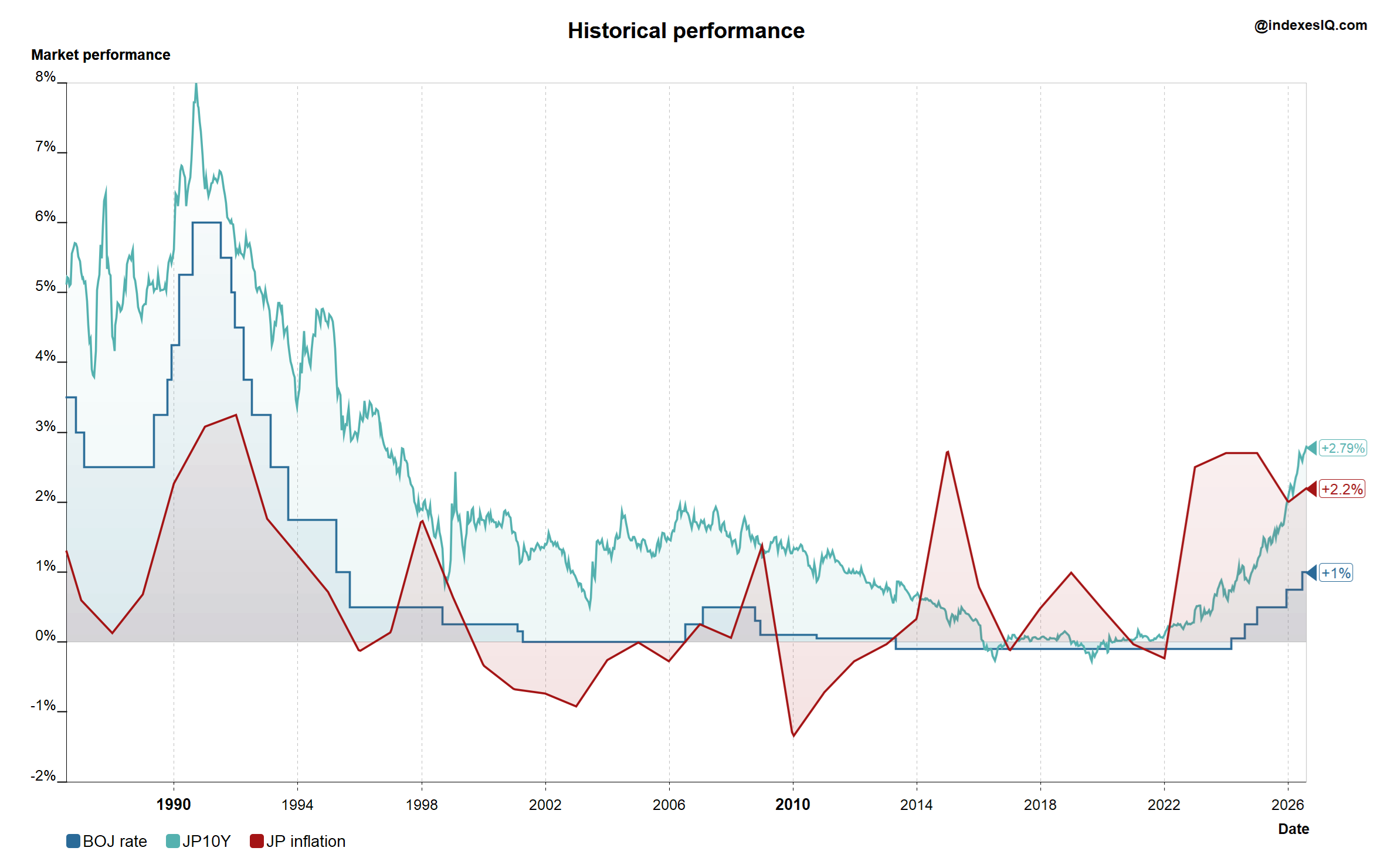
The deflation era and the recent return of inflation and rising rates are clearly visible. Source: IndexesIQ.
As Chart 8 shows, recent years have brought a new development. Inflation has returned to Japan — partly driven by energy prices and the weak yen pushing up import costs, partly by a genuine improvement in domestic demand and corporate pricing power. The BoJ has responded with a cautious, incremental tightening: rates have risen from negative territory to 1.0% by end of July 2026, and 10-year JGB yields have climbed toward 2.79%. Some economists see this as a long-overdue return to normality. Others see it as the beginning of a dangerous dilemma.
The Interest Rate Dilemma
A textbook central bank response to a weakening currency is to raise interest rates — higher rates attract capital inflows and support the exchange rate. But for the Bank of Japan, this conventional playbook runs into a wall of structural constraints.
The debt servicing dilemma. With government debt at over 200% of GDP, every percentage point rise in interest rates translates into an enormous increase in the cost of servicing that debt. Japan's government has been able to borrow cheaply for decades precisely because rates were near zero. A normalisation of rates to levels seen in the US or UK would make the fiscal arithmetic very difficult very quickly — debt interest costs would consume a rapidly growing share of government revenues.
The existing debt valuation dilemma. Rising rates do not just increase the cost of new borrowing — they reduce the market value of existing bonds. The BoJ holds nearly half of all outstanding JGBs. Under its accounting framework it holds bonds to maturity and does not need to mark them to market — so paper losses do not directly impair its balance sheet in the conventional sense. But the losses are real in economic terms, and they create political and institutional tensions about the BoJ's financial position.
The imported inflation dilemma. A weak yen imports inflation — every unit of energy, food and raw materials that Japan buys from abroad costs more in yen. This inflation is precisely what the BoJ is mandated to control. Yet to strengthen the yen requires raising rates, which threatens the debt servicing position. The BoJ is thus caught between two of its own mandates: price stability and financial stability.
The growth dilemma. Japan's recovery is still fragile. Raising rates too aggressively risks choking off the domestic demand recovery that has only recently taken hold after three lost decades. The BoJ must navigate between cooling imported inflation and not killing the first genuine growth momentum Japan has seen in years.
These competing pressures explain why, when the yen has come under severe pressure, it has been the Bank of Japan — acting in coordination with the Japanese Ministry of Finance — that has intervened directly in currency markets to stabilise the exchange rate, rather than relying solely on interest rate moves. This is a sign of how constrained conventional monetary policy has become.
Japan's Equity Recovery — Nikkei vs TOPIX
Chart 9: Nikkei 225 and TOPIX from October 1994 to end of July 2026 in JPY
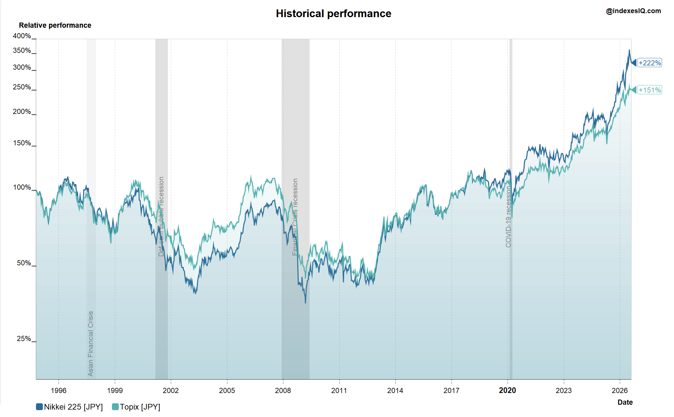
Nikkei +222%, TOPIX +151% over the period. Source: IndexesIQ.
Despite these macro pressures, as Chart 9 shows, Japanese equities have staged a remarkable recovery. From October 1994 to end of July 2026, the Nikkei 225 returned +222% and the broader TOPIX +151% in local currency terms — a meaningful divergence between the two main Japanese benchmarks.
As we explained in Insight #5, this divergence is captured by the NT ratio — the Nikkei 225 divided by the TOPIX. The Nikkei 225 is a price-weighted index of 225 stocks, heavily skewed toward high-priced technology and semiconductor companies like Tokyo Electron, Advantest and SoftBank. The TOPIX is a market-cap weighted index of all TSE Prime Market stocks, with a much larger representation of banks, industrials and domestic-demand companies. The NT ratio hit a record high of 15.74 in April 2026, driven by AI semiconductor stocks surging on global chip demand. The divergence between the two indexes is, in essence, a divergence between Japan's AI-exposed technology sector and its broader domestic economy — a microcosm of the same theme we explored globally in Insight #6.
The Widow-Maker Trade — Japan's Sovereign Debt
For many years, Japan's extraordinary debt burden attracted a steady stream of hedge fund managers convinced that a Greek-style sovereign debt crisis was inevitable. The most prominent was Kyle Bass of Hayman Capital, who in 2010 predicted at the Value Investing Congress that Japan was headed for default, describing its debt level as 24 times central government tax revenues and arguing that a fiscal explosion was only a matter of time. Bass was far from alone — a succession of macro investors built short positions in Japanese government bonds (JGBs), convinced that yields would spike as investors lost confidence in Japan's ability to service its debt.
It never happened. The trade became known as the "widow-maker" — a reference to the heart's left anterior descending artery, so named because a blockage there is almost always fatal. The JGB short trade, similarly, had a habit of destroying the investors who tried it. Year after year, yields stayed low, the BoJ absorbed supply, and the shorts were squeezed.
Why did Japan avoid a Greek-style crisis? The answer lies in the ownership structure of its debt. At end of 2024, 88.1% of Japanese government debt was held domestically — with the Bank of Japan holding 46.3%, domestic insurance companies 15.6% and domestic banks 14.5%. This is the critical difference. Greece's debt was held by foreign investors who could — and did — run at the first sign of stress, demanding higher yields to compensate for default risk. Japan's creditors are overwhelmingly domestic institutions, including the central bank itself, which holds bonds to maturity and cannot be panicked into selling. Japan was effectively insulated from the foreign capital flight that precipitates sovereign debt crises.
Japan was described, repeatedly, as an economic exception — a country for which the normal rules of sovereign debt sustainability simply did not apply.
Is Japan Still an Exception? The Bond Market under Rising Rates
Chart 10: Total Return 10-Year Treasury Indexes — Japan, US, UK and Germany, Past 10 Years to July 2026
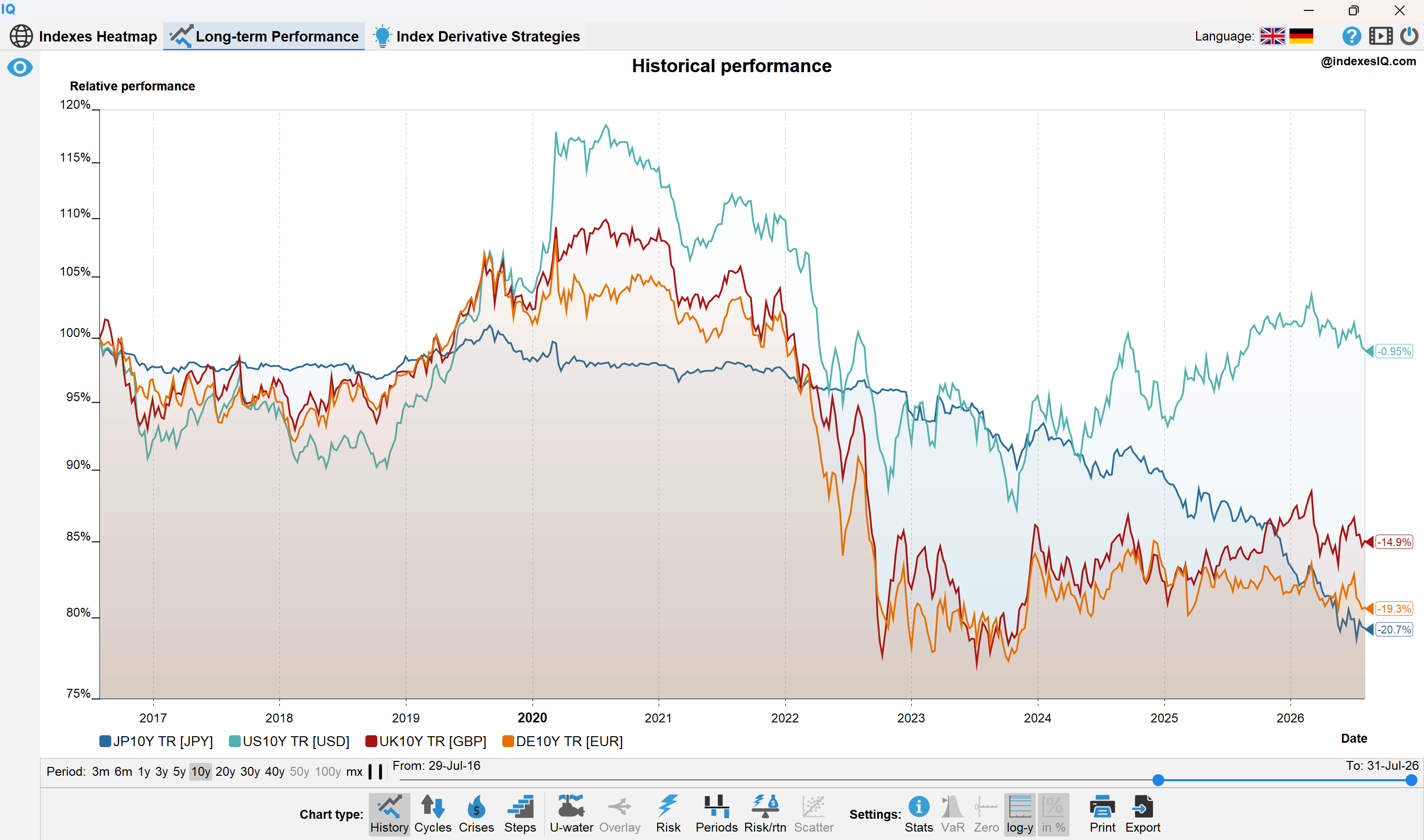
Calculated by IndexesIQ using the methodology described in the technical appendix. Source: IndexesIQ.
Chart 10 shows that over the past 10 years, the Japanese 10-year total return treasury index has been the worst performer among the four major sovereign bond markets, at −20.7%. This may seem counterintuitive — Japanese yields have been low, which should mean bond prices are high. But total return includes both carry (the coupon income) and price return. Low yields mean low carry. And crucially, as yields have risen from near zero toward 2.79%, the price impact has been severe — because Japanese bonds sit at the steepest part of the price-yield curve.
The Price-Yield Curve — Why Japan Is Most Exposed
Chart 11: Bond Price as a Function of Yield — 10-Year Bond
Convex price-yield relationship. Country dots sit exactly on the curve at their July 2026 yields. Labels shown in legend below.
Japan sits on the steepest part of the curve — a given rise in yield causes a larger price fall than for the US or UK. Yields approximate as at July 2026.
Chart 11 above illustrates a fundamental property of bond mathematics: the relationship between bond price and yield is convex — it is not a straight line. At low yields (the left side of the curve), the curve is steep: a small rise in yield causes a large fall in price. At high yields (the right side), the curve flattens: the same rise in yield causes a smaller price fall.
Japan, with a 10-year yield of approximately 2.79%, sits on the steeper part of this curve. The US at 4.75% and the UK at 5.06% sit on the flatter part. This means that for every basis point rise in Japanese yields, the price impact on JGBs is larger than the equivalent move in US Treasuries or UK Gilts. Japan's bonds are more interest-rate sensitive — they have higher duration — precisely because yields start from a lower base. This is why Japan's total return bond index has suffered more than its peers, even though its yield moves have been smaller in absolute terms than those of the US or UK.
Who Holds Japanese Debt — and Does It Still Matter?
As noted above, the Bank of Japan holds approximately 46% of all outstanding JGBs, domestic insurance companies hold 15.6% and domestic banks 14.5% — with 88% held domestically in total. The BoJ holds to maturity and does not mark to market. Insurance companies hold long-duration bonds as a liability match and are largely indifferent to short-term price moves. Domestic banks are more exposed — rising rates reduce the market value of their bond portfolios, and the Bank of Japan has acknowledged this risk explicitly in recent communications.
Foreign investors hold approximately 12% of JGBs — a small but growing share. As yields rise and Japan becomes more attractive to global fixed income investors, foreign participation is increasing. This is a slow but meaningful shift: it means Japan's insulation from foreign capital flight is gradually diminishing.
The widow-maker trade has been renamed, not retired. The question is no longer whether Japan will face a sudden Greek-style crisis driven by foreign creditor panic — that risk remains low given the ownership structure. The question is whether the slow, grinding pressure of higher servicing costs on a 200%+ debt-to-GDP burden will gradually constrain Japan's fiscal and monetary policy options in ways that create new vulnerabilities over the coming decade.
What Does This Mean for Investors?
For equity investors, the near-term picture remains constructive. The Nikkei's AI-driven surge, Japan's corporate governance reforms, and the export competitiveness delivered by a weak yen have created genuine earnings momentum. The BoJ's cautious rate normalisation has not yet derailed the equity recovery. But the NT ratio's record highs are a reminder that much of the recent performance is concentrated in a handful of AI-exposed names — the same concentration risk we identified across global markets in Insight #6.
For bond investors, the calculus is more complex. Rising yields mean rising carry — JGB yields at 2.79% are more attractive than they have been in decades. But duration risk remains elevated, and the price-yield convexity chart above shows that Japan is still on the sensitive part of the curve. Any further acceleration in yield normalisation would hit JGB prices hard.
For currency investors, the yen remains caught between the BoJ's desire to normalise rates and its fear of what aggressive tightening would do to government finances and economic growth. The Ministry of Finance will continue to intervene when yen weakness becomes disorderly — but structural yen appreciation requires a genuine closing of the interest rate differential with the US and Europe, which the BoJ cannot deliver quickly without significant fiscal pain.
Is Japan still an economic exception — insulated from the consequences of its extraordinary debt burden by the unique structure of its creditor base? The answer, for now, is: partially. The insulation is real but not absolute. It is diminishing at the margins as foreign ownership grows and as rising rates slowly increase the fiscal burden. Japan's interest rate dilemma has no clean resolution — only a series of difficult trade-offs that policymakers will be navigating for years to come.
Time will tell.
Japan's interest rate dilemma is structural: raising rates to defend the yen and control imported inflation conflicts directly with the need to keep debt servicing costs manageable on a 200%+ debt-to-GDP burden. The BoJ is caught between price stability and financial stability. Japan's sovereign debt crisis has been avoided — not because the debt is sustainable in the conventional sense, but because 88% is held domestically, with the BoJ as the largest creditor holding bonds to maturity. The widow-maker trade failed because it misunderstood this ownership structure. But the insulation is not permanent: rising rates are creating real losses on existing bonds, foreign ownership is slowly growing, and the price-yield convexity means Japanese bonds are the most rate-sensitive among major markets. Japan's equity recovery is real — but the bond market tells a more cautious story. Whether Japan remains an economic exception or gradually rejoins the rules of sovereign debt gravity is the defining long-term question for investors in the world's fourth-largest economy by nominal GDP — having been overtaken by Germany in 2023 and India in 2025 according to IMF data, in a symbolic reflection of the very long-cycle dynamics this series has explored.
Jump to: Part 1 · Part 2 · Part 3 · Part 4