
"When you come to a fork in the road, take it."
Yogi Berra
American baseball catcher and manager, celebrated for his aphorisms
Central Banks at the Fork in the Road
Central banks are always standing at some kind of fork in the road. Every rate decision is, in effect, a choice between two paths — and, as so often, last month's decisions made news and moved investment markets.
Take September 2026 alone. Among the central banks steering some of the world's most closely watched economies — several of them responsible for the very government bond markets we mapped in our Index Academy primer on sovereign debt markets — four raised interest rates and one cut them. The Fed hiked to 3.75–4.00%, the ECB to 2.50%, the Bank of Japan to 1.25% (its highest since 1995) and the RBA to 4.60% (its highest since 2011). The odd one out was Brazil's central bank, the BCB (Banco Central do Brasil) — not to be confused with the commercial lender Banco do Brasil — which cut its Selic rate to 13.75%, its first cut ahead of an election in two decades. This is a direct consequence of rising inflationary pressure, the same pressure we flagged from the bond market's side in Insight #8.
A Familiar Tide
Chart 1: Central Bank Policy Rates — Fed, BoE, ECB (Bundesbank pre-1999) and BoJ, August 1954–End September 2026
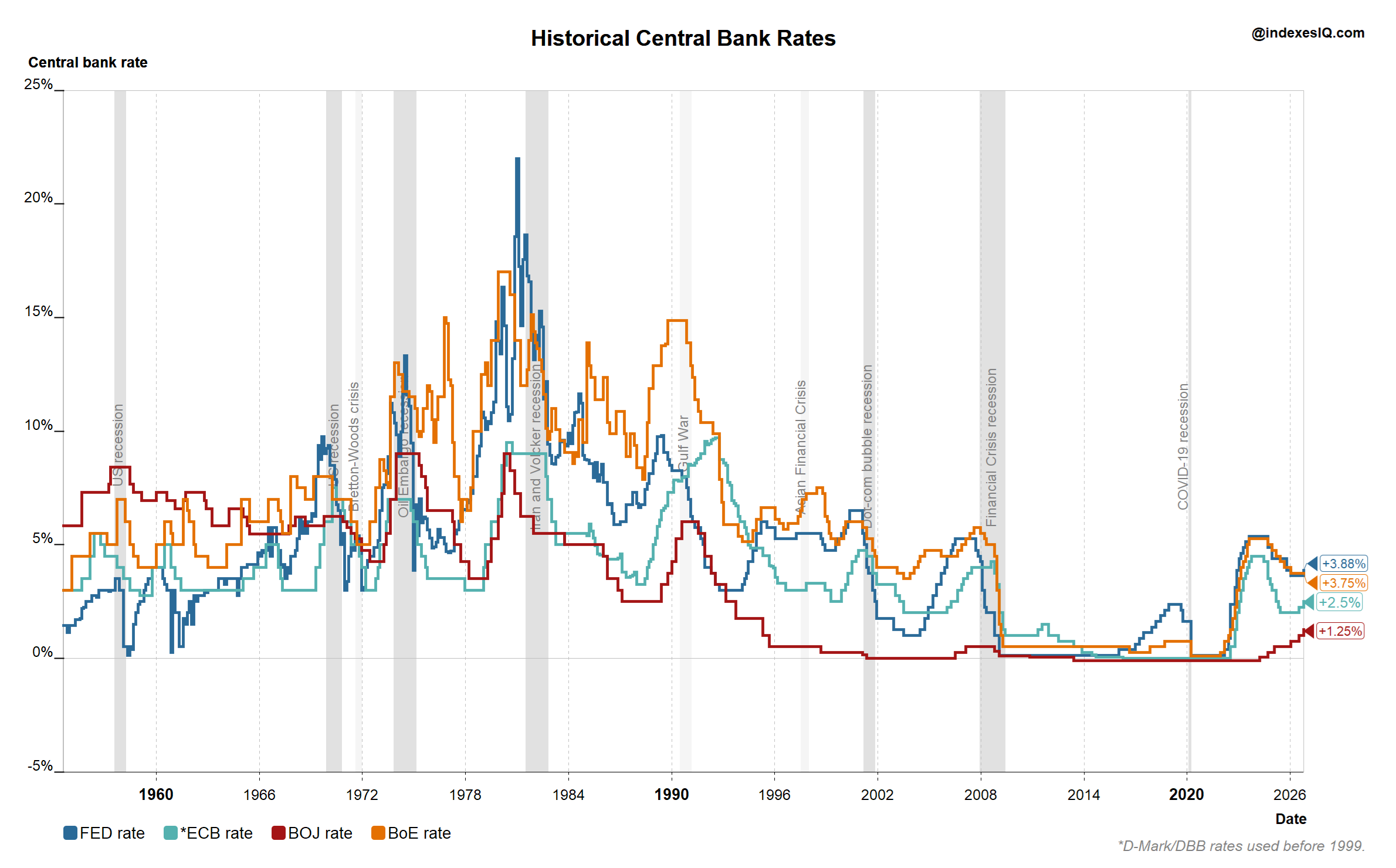
Policy rates for the Federal Reserve, Bank of England, European Central Bank (Bundesbank rate used before the euro's 1999 launch) and Bank of Japan, August 1954 to end of September 2026. Source: IndexesIQ.
If you read last month's insight on global treasury yields, Chart 1 will look familiar: the same long-term cycle in policy rates, up until 1981, down until around 2021, and now the recent uptick worldwide. The driver behind each of these three phases is, in essence, the same — inflationary pressure, whether it is being fought (as in the 1980s and today) or accommodated (as in the four decades in between).
The Old Tightrope: Growth vs Inflation
For most of the postwar era, central bankers were described as walking a tightrope — managing the trade-off between economic stimulus (which calls for lower rates) and taming inflation (which calls for higher ones). Readers who studied economics may remember this trade-off by name: the Phillips curve, the historical inverse relationship between unemployment and inflation that dominated monetary policy thinking from the 1950s onward.
Since the inflation spike of the early 1980s, taming inflation has been the clear priority, and the tool for doing so has been institutional: greater central bank independence and explicit inflation targeting. New Zealand went first — the Reserve Bank of New Zealand Act 1989 made it the first country to adopt formal inflation targeting, and Canada, the UK and Australia followed within a few years. The Bank of England was granted operational independence to set interest rates in 1997, formalised in the Bank of England Act 1998. The European Central Bank was designed to be independent of national governments from its 1998 founding under the Maastricht Treaty. And the US Federal Reserve, though never given a single inflation target by statute, demonstrated its practical independence when Paul Volcker broke double-digit inflation in the early 1980s regardless of the short-term economic cost.
The academic case for independence is well established. Rogoff (1985) argued that societies are better off appointing a "conservative" central banker who weights inflation-fighting more heavily than the electorate would, precisely to make low-inflation promises credible. Alesina and Summers (1993), studying sixteen OECD economies, found that politically-controlled central banks were associated with higher and more variable inflation, without any offsetting benefit to growth or employment. Both papers helped justify the wave of central bank independence reforms that followed.
A New Tightrope
But there is a new tightrope to walk — a new trade-off to manage — that we hinted at in our two previous insights (#7 and #8): the trade-off between taming inflation, which requires higher rates, and easing the fiscal pressure of servicing an ever-larger government debt burden, which is made worse by higher rates.
The table below sets out each central bank's mandate and inflation target alongside its economy's government indebtedness, the central bank's own holdings of that government's debt, and the resulting interest burden.
Table 1: Central Bank Mandates and the Fiscal Backdrop, 2026
| Central bank / economy | Mandate | Inflation target | Govt debt / GDP | CB holding of govt debt* | Interest expense / GDP | Implied effective rate |
|---|---|---|---|---|---|---|
 Fed / US Fed / US | Dual (employment & prices) | 2% PCE | ~126% | ~12% | ~3.6% | ~2.9% |
 BoE / UK BoE / UK | Price stability primary | 2% CPI | ~100% | ~19% | ~3.6% | ~3.6% |
 ECB / Euro area ECB / Euro area | Price stability primary | 2% HICP | ~89% | ~23% | ~1.9% | ~2.1% |
 SNB / Switzerland SNB / Switzerland | Price stability | <2% CPI | ~41% | ~1% | ~0.2% | ~0.5% |
 BoJ / Japan BoJ / Japan | Price stability | 2% CPI | ~204% | ~45% | ~0.6% | ~0.3% |
 RBA / Australia RBA / Australia | Dual / statutory welfare | 2–3% CPI | ~52% | ~17% | ~1.9% | ~3.7% |
 BoC / Canada BoC / Canada | Flexible inflation target | 2%; 1–3% range | ~113% | ~10% | ~3.6% | ~3.2% |
Govt debt/GDP is general government gross debt (IMF/Eurostat basis), consistent with the figures used in Insight #8 and our sovereign debt primer; the euro area row is the currency-union aggregate, not any single member state. CB holding of govt debt is IndexesIQ's estimate of each central bank's own holdings as a share of outstanding government debt, based on the latest published balance sheet data (Fed SOMA, Eurosystem APP/PEPP holdings, BoE Asset Purchase Facility, Bank of Japan flow-of-funds data, RBA and Bank of Canada holdings disclosures). Interest expense/GDP is general government net interest payments; the UK figure is sourced directly from the Bank of England's own 2025/26 estimate, others are IndexesIQ estimates (marked ~) derived from published debt levels and average effective borrowing costs. Implied effective rate is interest expense/GDP divided by debt/GDP, i.e. the average rate the government is effectively paying across its whole stock of debt — necessarily lower than today's policy rate wherever a large share of debt was issued in the low-rate years before 2022.
One further difference is worth a note, since it is often misunderstood: like almost every central bank in this table, the SNB is restricted to buying government debt in the secondary market only, not directly from the government at issuance. That separation between the central bank and the government's financing needs is not a Swiss quirk — it is a cornerstone of the independence discussed above, and it is written into the ECB's own treaty (primary-market purchases are explicitly banned under Article 123 of the Treaty on the Functioning of the EU) as much as into Swiss law. What actually sets the SNB apart is not this rule but how little it is used: its holdings of Swiss federal debt are negligible, a reflection of Switzerland's tiny borrowing requirement and the SNB's traditional preference for holding foreign-currency reserves rather than domestic bonds.
Quantitative Tightening — The Squeeze Continues, Unevenly
Given the high debt levels, heavy interest burdens and, in several cases, large central bank holdings shown above, even a central bank simply not rolling over its expiring bond holdings — let alone actively selling them — adds further upward pressure on the yields governments must pay, making debt financing harder still. This process, quantitative tightening (QT), has been running for several years now, though at a different pace and stage in each economy:
- The Federal Reserve slowed its runoff cap from $25bn to $5bn per month in April 2025, then stopped balance sheet runoff entirely on 1 December 2025, ending three years of QT and switching back to reinvesting maturing securities.
- The ECB has not slowed down: reinvestments stopped in mid-2023 under its pre-pandemic bond-buying programme, the APP (Asset Purchase Programme), and at end-2024 under its Covid-era programme, the PEPP (Pandemic Emergency Purchase Programme). With neither programme's maturing bonds being replaced, the Eurosystem is on track to let a further roughly €500 billion of holdings mature unreinvested in 2026 (about €330bn under the APP and €173bn under the PEPP).
- The Bank of England has gone the other way. Having reduced its annual gilt-sales target from £100bn to £70bn a year earlier, it announced on 17 September 2026 that it would scrap sales of long-dated gilts altogether, cutting the pace of active sales to £20bn a year and the total annual run-down (including natural maturities) to around £46bn, with its remaining £488bn portfolio now expected to be unwound gradually by 2034.
Not surprisingly, then, some central banks have slowed their balance sheet downsizing rather than press on regardless — the Fed has stopped entirely, and the Bank of England has deliberately eased off, both citing the risk that continued sales would push long-term yields higher than policymakers are comfortable with. In principle, QT should mean long yields rising and the yield curve steepening, as the central bank withdraws as a buyer and the market has to absorb more net new supply of long-dated debt.
The Yield Curve: Flatter, Not Steeper
Chart 2: 10-Year Minus 2-Year Government Bond Yield Spread — US, Germany, UK, Canada and Australia, End September 2021–End September 2026
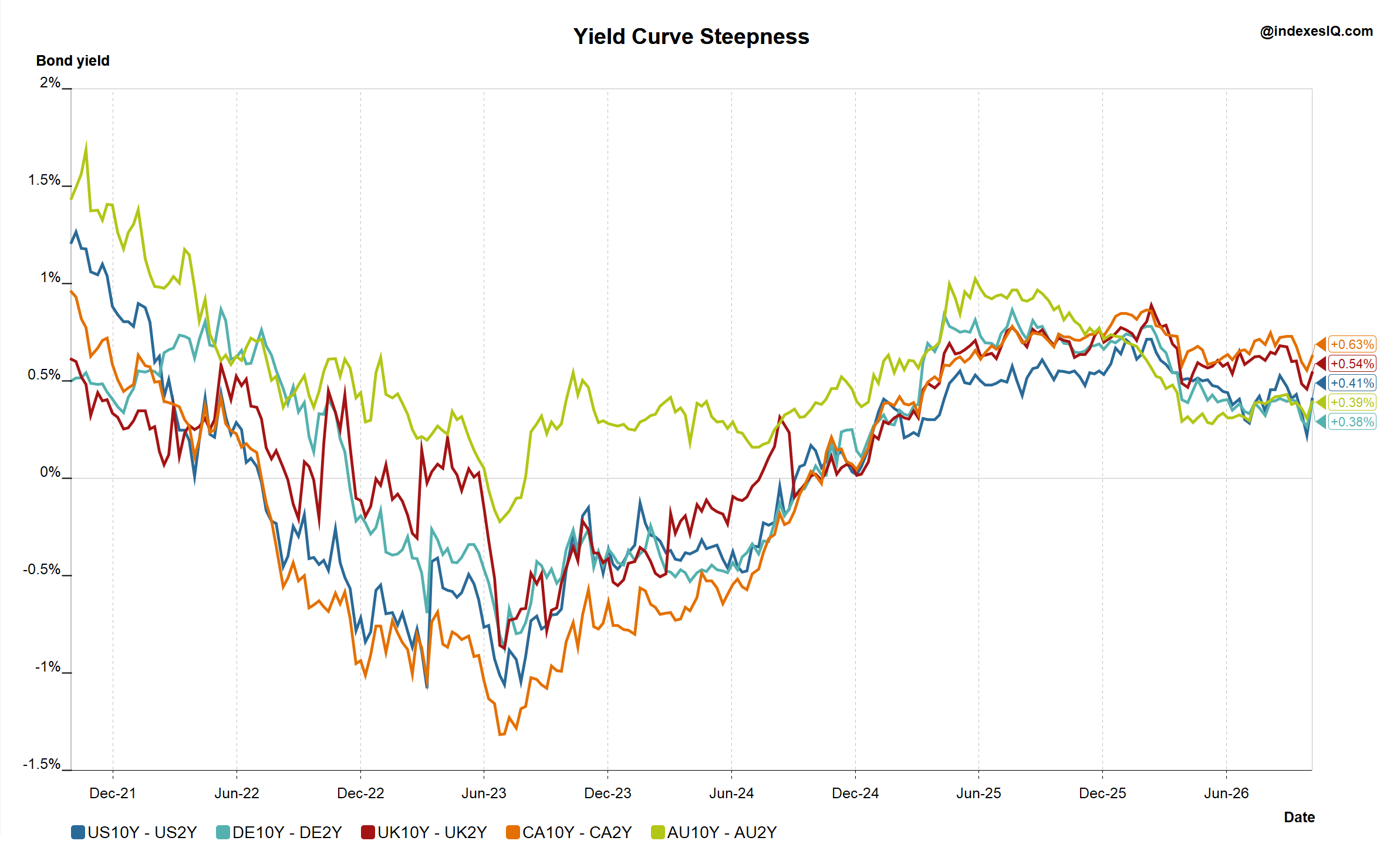
10-year minus 2-year government bond yield spread, US Treasuries, German Bunds, UK Gilts, Canadian and Australian government bonds, end of September 2021 to end of September 2026. Source: IndexesIQ.
Chart 2 tells a story in two acts. Through 2023 and 2024, every one of these curves was actually steepening from deeply inverted levels — in June 2023, all five were inverted at once, as central banks kept hiking short-term rates well above where markets expected them to settle. That pattern has now reversed: through 2026, curves have turned flat or are flattening further. As of end of September 2026, the US spread stood at +41bp and Germany's at +38bp, with the UK, Canadian and Australian curves showing a similar compression toward flat. The driver is straightforward: short-term rates have risen sharply as central banks hiked through 2026, while long-term yields — though also higher in absolute terms than a few years ago — have risen by less, so the gap between the two has narrowed.
This is where the slowdown in QT matters. Active or passive central bank selling adds to the net supply of long-dated bonds that private investors must absorb, which is exactly the kind of pressure that pushes up long-term yields and steepens the curve. With the Fed now fully reinvesting and the Bank of England deliberately easing off its own sales, some of that upward pressure on the long end has been removed at precisely the point when short rates are still rising. The result reinforces the flattening we are observing: short yields keep climbing with policy, while long yields are not being pushed up as hard as they otherwise would be.
What Matters Is the Real Rate
Chart 3: Real 2-Year Government Bond Yields — US, Germany, UK and Australia, End September 1996–End September 2026
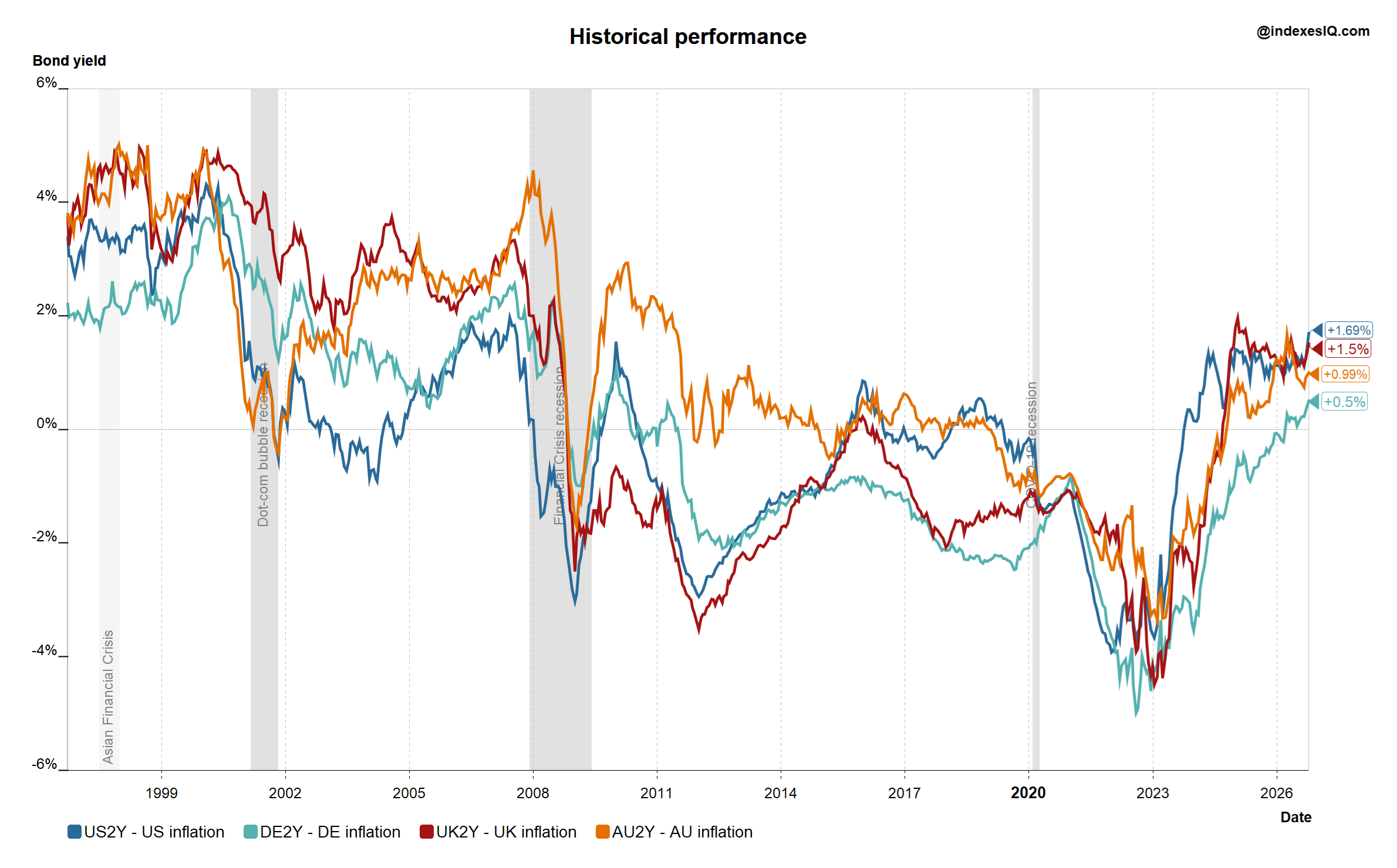
2-year government bond yield minus headline CPI/HICP inflation, US, Germany, UK and Australia, end of September 1996 to end of September 2026. Source: IndexesIQ.
In the real economy, though, what matters most is not the nominal interest rate or yield but the real rate — the nominal figure minus inflation. Chart 3 shows 2-year real yields for the four countries above over three decades. After a period of sharply negative real yields following the Covid pandemic, real yields turned positive again in 2025, and as of September 2026 they range from around +0.5% in Germany, to +1.5% in the UK, and close to +1.7% in the US, with Australia in a similar range to the UK and US.
This matters in two ways. First, for fiscal policymakers, the era in which the debt burden was quietly eroded by inflation — because inflation ran higher than the interest rate being paid — is over. Second, for investors, it means government bonds are once again offering genuinely positive real returns, with the caveat we raised in Insight #7: if yields rise further from here, existing bond prices will fall, especially for longer-dated bonds. Because 10-year yields sit higher than 2-year yields in every market shown, their real yields are higher still — meaning today's bond buyer locks in a larger real return, at the cost of greater price sensitivity if yields keep climbing.
The Exception: Switzerland
One exception to almost everything above is worth calling out: Switzerland. As the table shows, Swiss government debt is low and the SNB's holdings of that debt are minimal.
Chart 4: SNB Policy Rate, 10-Year Swiss Government Bond Yield and Swiss Inflation, End September 1986–End September 2026
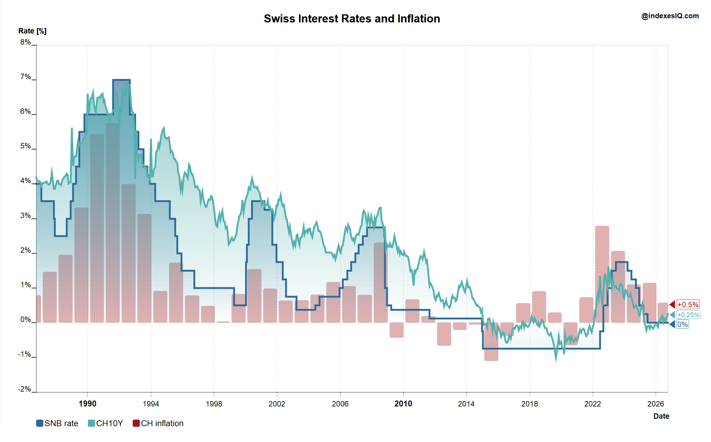
SNB policy rate, 10-year Swiss government bond yield and Swiss CPI inflation, end of September 1986 to end of September 2026. Source: IndexesIQ.
As Chart 4 illustrates, the SNB policy rate and Swiss short-term yields are still running slightly below Switzerland's own benign inflation rate, meaning Swiss real yields remain marginally negative even as every other market shown in Chart 3 has turned positive.
The explanation lies in decades of conservative policy choices: a constitutional "debt brake" in place since 2003, which ties federal spending growth to the economic cycle and has kept Swiss borrowing needs structurally small; and an SNB that has stayed independent in practice by never needing to become a large holder of its own government's debt in the first place. Switzerland and the SNB have, in effect, avoided the new tightrope altogether.
The shift in bond yields documented in Insight #8 is now visible in inflation data and central bank policy too: four of the world's most-watched central banks hiked last month, only Brazil's cut. Real yields turning positive since 2025 is a double-edged sword — a genuine fiscal burden for indebted governments, and genuinely positive returns for bond investors, at the price of continued sensitivity to further rate rises. And in theory, central banks are meant to be independent of fiscal policy — that is what good governance requires. In practice, most of them are now deeply intertwined with fiscal policy through their own holdings of government debt, a legacy of a decade and a half of quantitative easing that some are now only slowly starting to unwind. Switzerland, with its tiny debt burden and negligible central bank holdings, is the clearest exception that proves the rule.
"In theory there is no difference between theory and practice. In practice there is."
Yogi Berra
Again, we can learn from him