
"In the short run, the market is a voting machine. In the long run, it is a weighing machine."
Benjamin Graham
Economist & investor — The Intelligent Investor (1949)
A World Divided — Historic Divergence in Global Markets
The rise of artificial intelligence has created winners and losers across global equity markets on a scale rarely seen in a single year. The divergence is visible at the global level — KOSPI at +141% in USD, DAX at +1% — and within Asia, where equity performance and currency moves compound each other in both directions. In this series we examine the evidence market by market: the global picture, Asian markets in depth, Europe's structural underperformance, and the long-run question of whether markets have simply outrun GDP.
This four-part series looks at the historic divergence running through global equity markets in 2026. We start with the global heatmap and the AI-driven gap between winners and losers, then zoom into Asia to see how equity gains and currency moves compound — or offset — each other. From there we turn to Europe's quieter recovery story, and close with the long view: whether global equity valuations have simply outrun GDP growth.
In this series:
- Just how wide is the divergence? — The global heatmap from KOSPI at +141% to the DAX at +1%, and why emerging markets are suddenly ahead
- Why are Asia's winning currencies losing? — The equity and currency split across Korea, Taiwan, India, Hong Kong and China's two very different markets
- Is Europe finally healing? — The crisis-era laggards leading the pack, and what 17 years since 2008 really show
- Are global markets overvalued? — The Buffett Indicator, the Ireland distortion, and Martin Wolf's "Next Crash"
You can read the series in order, or jump straight to the part that interests you most.
Part 1 of 4
A World Divided — Global Equity Markets at a Historic Divergence
Chart 1: Global Equity Markets Heatmap — 1-Year USD Performance, End of June 2026
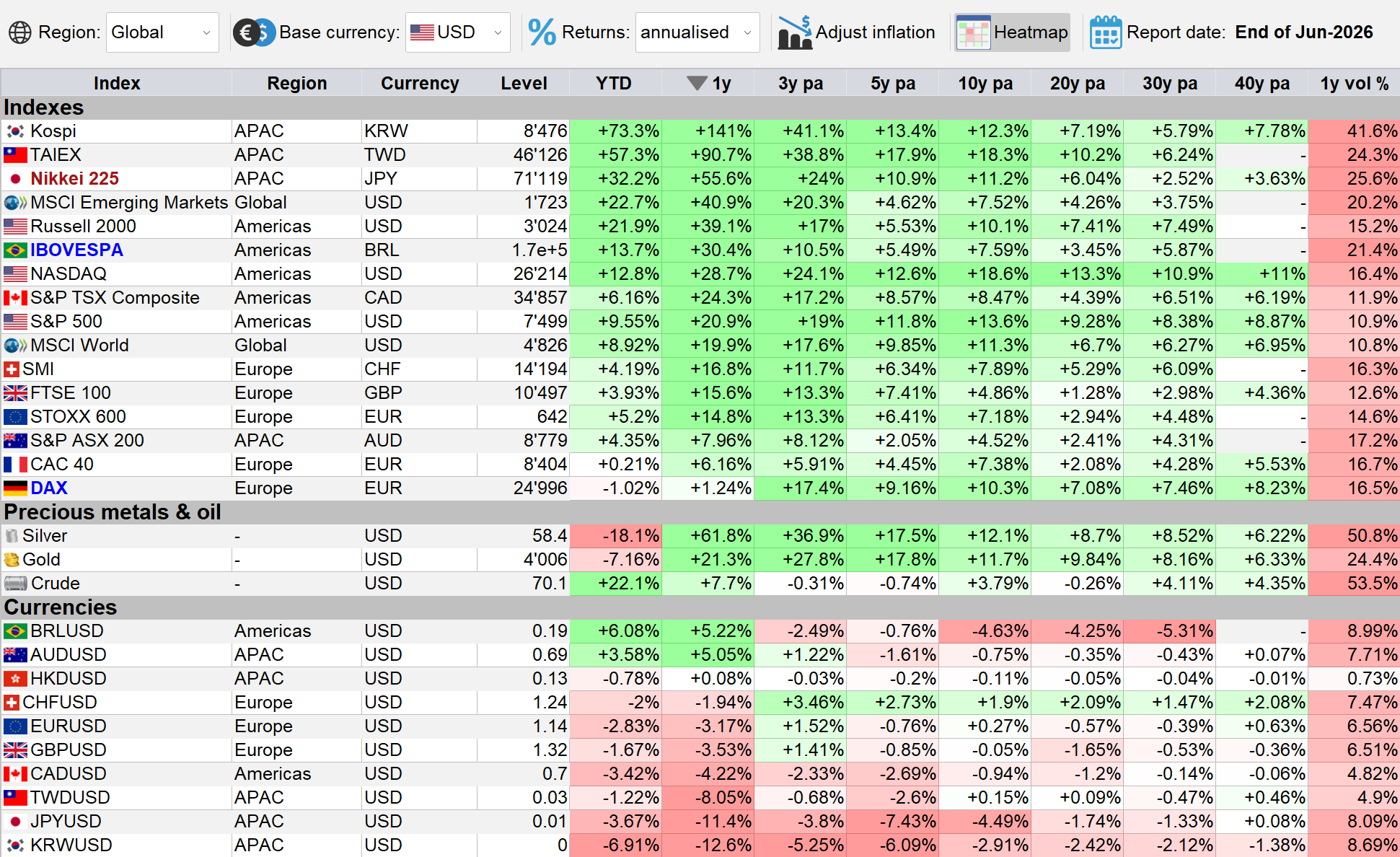
IndexesIQ global indexes heatmap — sorted by 1-year performance in USD, end of June 2026. From KOSPI at +141% to the CAC 40 at +6% and the DAX at +1%.
The spread between the world's best and worst performing equity markets over the past 12 months is extraordinary. At the top, Asia dominates: the KOSPI at +141% and the TAIEX at +91% — both driven by the AI semiconductor boom examined in detail in Insight #5. At the bottom, Europe lags far behind: the CAC 40 at +6% and the DAX at just +1%.
That comparison requires an important methodological note: the DAX is a total return index that includes reinvested dividends, while most other indexes in this table are price-only. On a like-for-like price basis, the DAX's underperformance is even more pronounced than the raw number suggests.
Why Did Germany and France Underperform?
Europe's poor showing is not an accident. Germany's economy has faced a structural squeeze: high energy costs following the end of cheap Russian gas, a collapse in Chinese demand for German industrial goods, and a domestic automotive sector under pressure from the electric vehicle transition. The DAX is heavily weighted toward export-driven industrials and chemicals — precisely the sectors most exposed to these headwinds.
France faces its own challenges. Political uncertainty — including a hung parliament and fiscal pressures — has weighed on sentiment. The CAC 40 is dominated by luxury goods companies, which have suffered from a slowdown in Chinese consumer spending, and by banks sensitive to European growth concerns. Neither index has meaningful exposure to the AI semiconductor theme that drove Asian markets.
A Surprise in the US: Russell 2000 Ahead of the NASDAQ
Within the US, the heatmap reveals an interesting nuance: the Russell 2000 — the small-cap benchmark — outperformed both the NASDAQ and the S&P 500 over the past 12 months. Part of this is a long-overdue small-cap catch-up after years of underperformance. But part of it is also the AI boom itself: many of the Russell 2000's components are suppliers of components, materials and equipment to the semiconductor industry. The AI wave has lifted not just the flagship chip designers but the entire supply chain beneath them.
Brazil: A Standout in Emerging Markets
The Ibovespa's +30% in USD terms is one of the most notable performances outside Asia. The gain has two components. First, a strong domestic equity rally driven by resilient corporate earnings, robust commodity revenues and an improving fiscal outlook. Second — and critically for USD-based investors — a significant strengthening of the Brazilian real, which was the strongest major currency against the dollar over the period at +6%. For international investors, currency matters as much as the local index return.
Emerging Markets Outperform Developed Markets — A Historic Shift
The aggregate result of these moves is striking: MSCI Emerging Markets returned +41% over the past 12 months versus +20% for MSCI World. The large weights of Korea, Taiwan and Brazil in the EM index drove much of this outperformance.
This is a meaningful reversal. The previous decade was defined by chronic EM underperformance as the US tech sector dominated global returns. Whether this is the start of a sustained EM cycle — or a concentrated AI-driven spike that will revert — is the central question for global asset allocators right now.
Explore It Yourself: Divergence and Correlations in the App
Chart 1 is one snapshot in time. If you open the IndexesIQ browser app or Windows desktop app and scroll back through history, two things become immediately visible.
First, the performance divergence across markets was historically much smaller. A 140-percentage-point spread between the best and worst equity market in a single year is exceptional by any historical standard. Second, the correlation matrix — also visible in Chart 1 — shows that the KOSPI, TAIEX and Nikkei have moved to unusually high correlations with each other. Three national markets that were once driven by distinct domestic factors are now highly synchronised around a single global theme: the AI semiconductor supply chain. That concentration of a single narrative across multiple markets is itself a risk worth watching.
The divergence between global equity markets has reached historic levels — driven overwhelmingly by a single theme: AI semiconductor exposure. Markets with heavy AI supply chain presence have soared; markets without it have barely moved. Emerging markets outperformed developed markets for the first time in a decade, but the outperformance is concentrated rather than broad. Currency matters as much as equity returns for international investors. And the unusually high correlations between the KOSPI, TAIEX and Nikkei are a reminder that diversification across geographies is less effective when multiple markets are driven by the same underlying narrative.
Jump to: Part 1 · Part 2 · Part 3 · Part 4
Part 2 of 4
The Great Divergence in Asian Markets — Equities and Currencies Tell the Same Story
Chart 2: Asian Markets Heatmap — 1-Year USD Return, End of June 2026
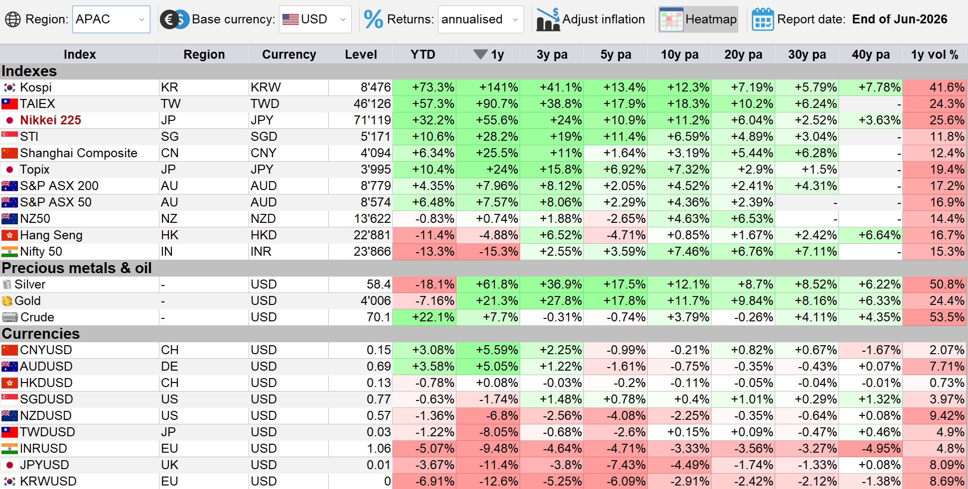
IndexesIQ Asian markets heatmap — sorted by 1-year performance in USD, end of June 2026. The dispersion in both equity returns and currency moves is extraordinary.
Chart 2 tells a story with two layers: equity performance and currency moves. When you combine them — as USD-based investors must — the outcomes range from extraordinary gains to significant losses, all within the same region and the same 12-month window.
Why Did AI Boom Currencies Weaken Against the Dollar?
This is one of the most counterintuitive findings in the data. The countries that saw the largest equity gains also saw their currencies depreciate sharply against the USD: the Korean won −12.6%, the Japanese yen −11.4%, the Taiwan dollar −8.1%, the Indian rupee −9.5% and the New Zealand dollar −6 to −8%.
The explanation lies in interest rate differentials and capital flow dynamics. Japan's yen remains a funding currency for global carry trades — investors borrow in yen to invest in higher-yielding assets elsewhere, structurally suppressing the currency. Korea and Taiwan kept rates relatively low to support their export-driven economies. When global capital flooded into their stock markets, it did not automatically flow into their currencies — much of the equity investment is hedged or flows through structures that do not require buying the local currency outright. India's rupee weakness reflects persistent current account deficits and the RBI's active management of the exchange rate to protect export competitiveness.
The practical consequence for USD-based investors: the extraordinary local equity gains in Korea and Taiwan were partially offset by currency losses. A Korean investor in the KOSPI saw a very different return than an American investor converting back to dollars.
Why Did the CNY and AUD Strengthen?
The contrast with the Chinese renminbi (+5.6%) and Australian dollar (+5.1%) is instructive. China's currency strength reflects deliberate policy: the PBOC managed the CNY carefully to signal stability and attract foreign capital. Australia's dollar strengthened on commodity demand — iron ore, coal and lithium exports benefited from continued global infrastructure and energy transition spending.
Why Did India and Hong Kong Underperform?
The Nifty 50 returned −15.3% in USD and the Hang Seng −5.9%. Both are the product of compounding equity weakness with currency losses. Indian valuations had become stretched after years of strong outperformance, and foreign investors rotated capital into higher-momentum AI markets. The rupee's −9.5% depreciation turned a moderate local drawdown into a significant USD loss.
Hong Kong's Hang Seng is dominated by Chinese technology companies and property developers — sectors facing sustained regulatory pressure, a prolonged property correction and weak consumer sentiment. Despite the HKD's USD peg eliminating currency risk, the index has failed to attract the capital flows that went to AI-exposed markets.
Shanghai +25.5% vs Hang Seng −5.9% — Two Very Different Chinas
This divergence surprises many investors who view both as "China" markets. The Shanghai Composite is dominated by state-owned enterprises in banking, energy and industrials — sectors that benefited from targeted government stimulus and infrastructure spending. The Hang Seng is dominated by private-sector technology companies — Alibaba, Tencent, Meituan — which have faced ongoing regulatory headwinds. The two indexes measure very different slices of the Chinese economy, and in the current policy environment, state-owned industry has significantly outperformed private technology.
Explore It Yourself: Local Currency vs USD, and Correlations Over Time
Two things are worth exploring in the IndexesIQ browser app or Windows app. First, switch the currency to "local": for Korea, Taiwan, India and Japan, local investors saw meaningfully higher returns than the USD figures suggest — the gap between local and USD returns is itself a measure of how much currency volatility mattered. Second, scroll the report date back through history: the dispersion of returns was historically much smaller, and the correlations between the AI boom countries — visible in the correlation matrix on the right-hand side of the heatmap — were lower. We are living in a period of unusually concentrated, theme-driven market behaviour.
Asia is not one market — it never was. But the divergence within the region has rarely been this wide. The AI semiconductor theme has produced extraordinary equity gains in Korea, Taiwan and Japan, while simultaneously contributing to currency weakness in those same markets. India and Hong Kong have lagged on both equity and currency fronts. China presents a split picture: state-owned Shanghai enterprises surging while Hong Kong-listed private technology companies remain depressed. For international investors, the currency layer is inseparable from the equity story — and the correlation structure of Asian markets tells you that a single narrative is driving an unusually large share of outcomes across the region.
Jump to: Part 1 · Part 2 · Part 3 · Part 4
Part 3 of 4
Europe's Quiet Divergence — No AI Boom, But a Recovery Story Emerging
Chart 3: European Markets Heatmap — 1-Year USD Performance, End of June 2026
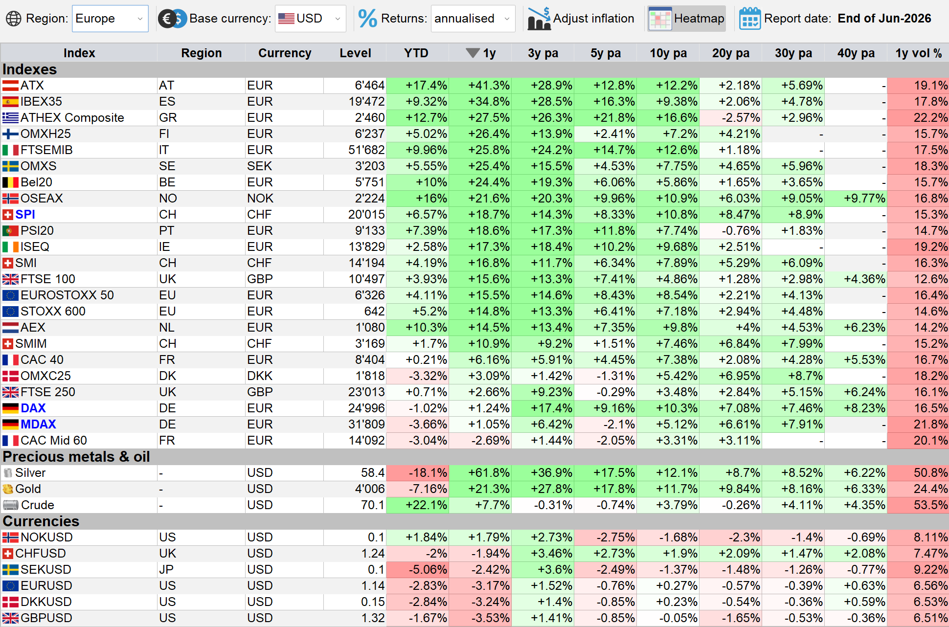
European markets heatmap — sorted by 1-year performance in USD, end of June 2026. From ATX at +41.3% to CAC Mid 60 at −2.7%.
Europe missed the AI boom. As we showed in Part 1, the DAX returned just +1% in USD terms over the past 12 months and the CAC 40 +6% — laggards in a world dominated by AI semiconductor markets. But zoom into Europe alone and a very different story appears: within the continent, the divergence has been striking, and the pattern of winners and losers reveals something important about what is quietly happening beneath the surface.
The European Leaderboard — and Why
The best performers in Europe over the past 12 months in USD terms are markets that spent the last decade and a half in the shadow of the financial crisis: the ATX (Austria) at +41.3%, the IBEX 35 (Spain) at +34.8%, the ATHEX (Greece) at +27.5% and the FTSE MIB (Italy) at +26.4%. These are not AI stories. They are recovery stories.
Austria's ATX is heavily weighted toward banking and energy — sectors that benefited from higher interest rates and strong commodity revenues. Spain's IBEX 35 similarly has large bank weightings, and Spanish banks have been among the most profitable in Europe in the higher-rate environment. Italy's FTSE MIB tells the same story: Unicredit, Intesa Sanpaolo and ENI have all been significant beneficiaries of the rate cycle and energy markets.
Greece's ATHEX deserves special mention. After losing more than 90% of its value from its pre-crisis peak to its 2012 trough, the Greek market has been slowly, fitfully recovering for over a decade. The past year's +27.5% in USD terms reflects continued normalisation of the Greek economy — tourism revenues at record levels, fiscal consolidation finally delivering results, and international capital cautiously returning to a market that was written off entirely during the sovereign debt crisis.
At the bottom, the CAC Mid 60 at −2.7% leads the laggards. This points to a consistent pattern across the continent: mid-caps underperformed their blue-chip counterparts everywhere. The CAC Mid 60 lagged the CAC 40, the MDAX trailed the DAX, and the FTSE 250 fell behind the FTSE 100. In an environment of higher borrowing costs and subdued domestic demand, smaller companies — more dependent on domestic financing and more exposed to cost pressures — struggled relative to large-cap multinationals with access to global capital markets and diversified revenue streams.
European Currencies — Only the NOK in Positive Territory
The currency picture reinforces the story. Of all European currencies, only the Norwegian krone gained against the USD at +1.8% — supported by Norway's oil revenues and the sovereign wealth fund's stabilising presence. Every other major European currency lost ground: sterling fell −3.5%, the weakest of the group, reflecting ongoing UK fiscal concerns and growth headwinds. Even the Swiss franc lost almost 2% — a striking development for a currency that has spent decades appreciating against almost everything. For USD-based investors, these currency losses trimmed returns across the board, turning some modest local-currency gains into flat or negative USD outcomes.
The Long Shadow of the Financial Crisis — and a Tentative Healing
Chart 4: DAX, ATX, IBEX 35 and ATHEX Relative to STOXX 600, 2008–June 2026
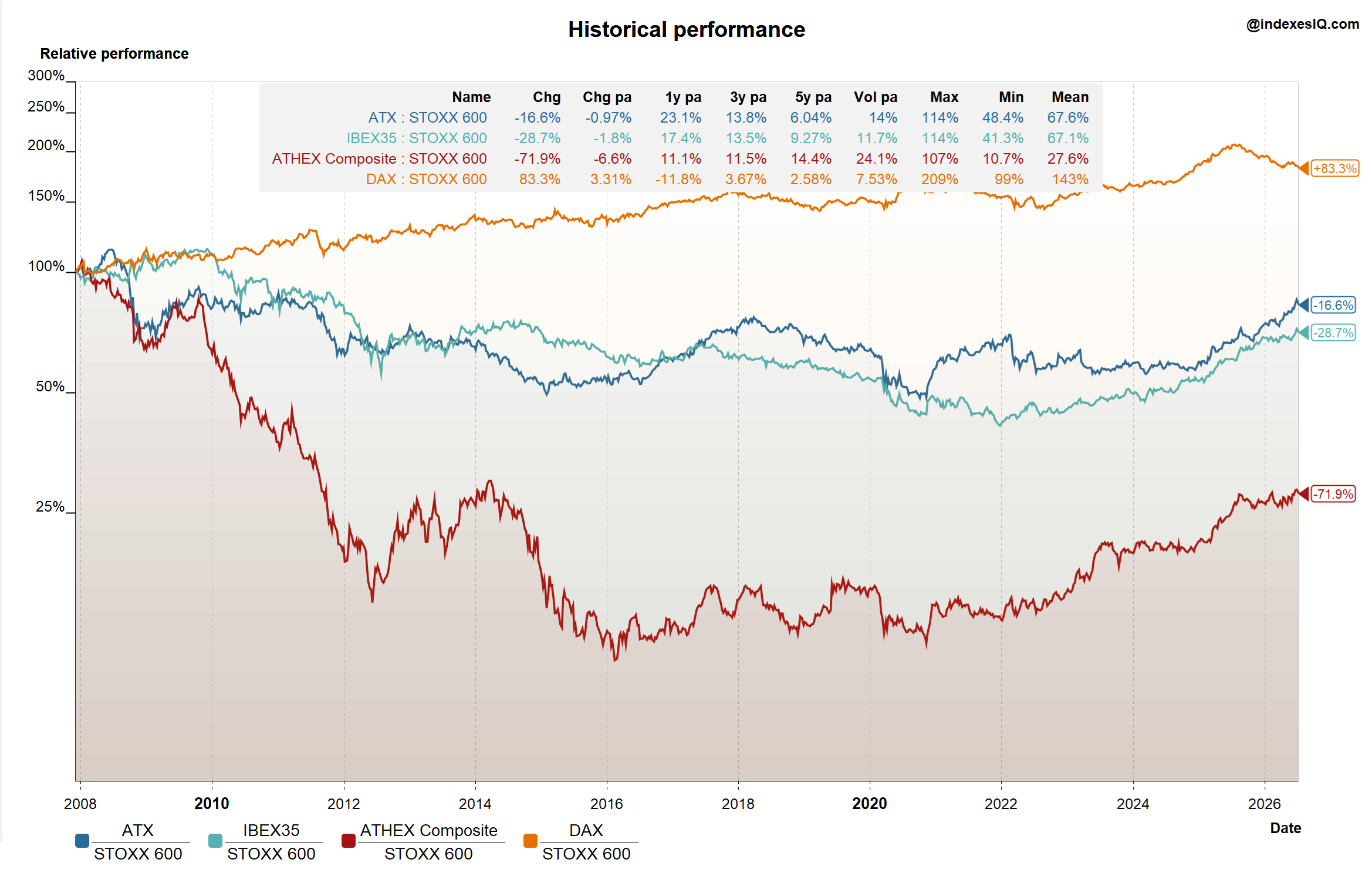
Relative performance of the DAX, ATX, IBEX 35 and ATHEX vs the STOXX 600, indexed from the 2008 financial crisis to end of June 2026.
Chart 4 puts the recent moves in their full historical context. Since the 2008 financial crisis, the divergence within European equity markets has been enormous. The DAX outperformed the STOXX 600 by +83% over the full period — though as we noted in Insight #4, the DAX is a total return index that includes reinvested dividends, which accounts for a significant portion of that gap. On a price-only basis, the outperformance would be materially smaller.
At the other end of the spectrum, the peripheral markets have never recovered. The ATX is still −17% behind the STOXX 600 over the full period, the IBEX 35 −29% behind and the ATHEX an extraordinary −72% behind. These numbers reflect the depth of the wounds inflicted by the sovereign debt crisis of 2010–2015, which devastated Greek, Spanish and Austrian financial institutions and took years to resolve.
But Chart 4's most important message is in the recent movement. The last 12 months have seen a clear reversal of relative trends: the long-term laggards — Austria, Spain, Greece, Italy — have started to outperform the STOXX 600, while the DAX has given back ground. This is not yet a full recovery. The gaps remain enormous. But the direction has changed.
Is Europe finally healing the scars from the great financial crisis? The data suggests a beginning, most visibly in Greece — a market that spent a decade and a half as a symbol of European fragility and is now, tentatively, becoming a symbol of something else.
Europe's story in the past year is not about AI — it is about the slow, uneven healing of financial crisis wounds. The outperformers are the crisis-era laggards: Austria, Spain, Greece and Italy, all driven by banks and energy companies benefiting from higher rates and commodity revenues. Mid-caps lagged blue chips everywhere, and European currencies broadly weakened against the dollar. The longer-term chart tells a sobering story: even after a strong year, the peripheral markets remain deeply behind the STOXX 600 benchmark since 2008. The gap is closing — but it remains very wide. Graham's weighing machine is still counting.
Jump to: Part 1 · Part 2 · Part 3 · Part 4
Part 4 of 4
Market Caps vs GDP — Are Equity Markets Overvalued Globally?
The previous three parts of this series examined the short-term dimensions of the current market divide: the AI boom, the divergence within Asia, and Europe's slow recovery from the financial crisis. This final part steps back to the long view — and takes its cue from a weekend article in the Financial Times by Martin Wolf, "The Next Crash", which reminded me of something that is central to the mission of IndexesIQ: the long term is where the real story lives.
Wolf's article draws on what is sometimes called the Buffett Indicator — the ratio of total US market capitalisation to GDP. The ratio previously peaked during the dot-com bubble at above 150%. It has now reached approximately 200%, a level that Wolf and Buffett both interpret as a signal of extreme valuation exuberance.
Building the Indicator in IndexesIQ
Chart 5: S&P 500, Topix and STOXX 600 Relative to GDP Growth, 2008–June 2026
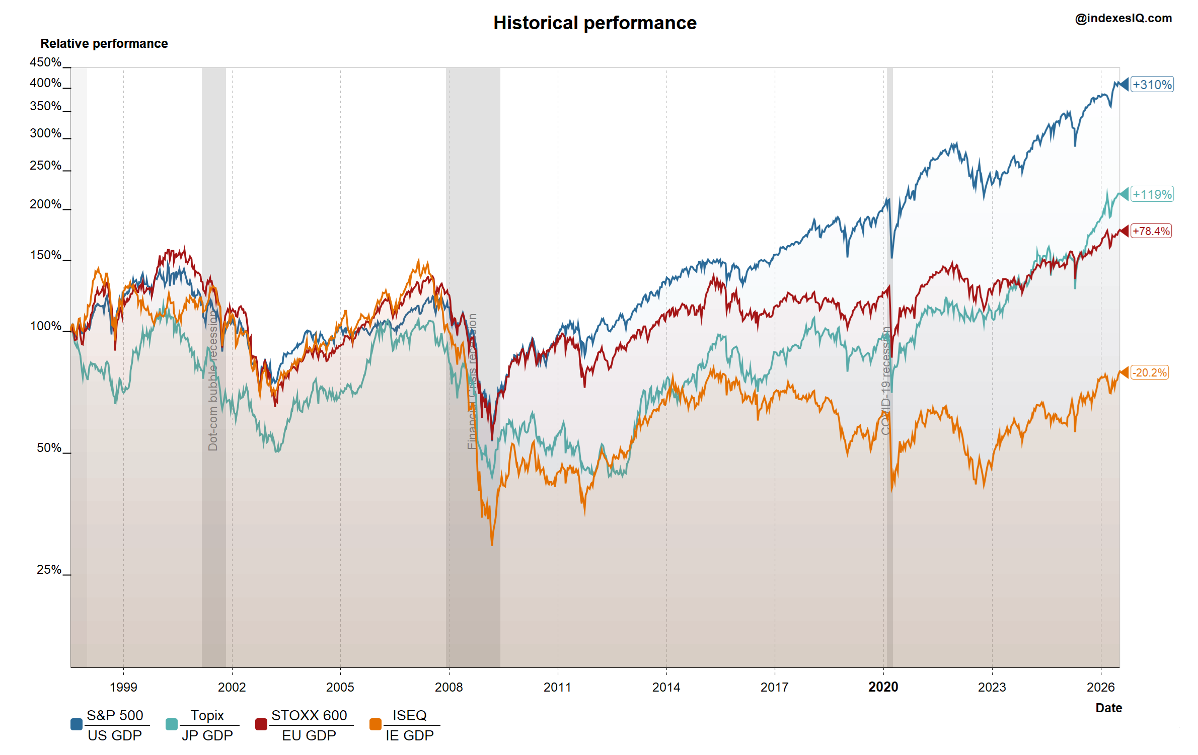
GDP-adjusted performance of the S&P 500 (US), Topix (Japan) and STOXX 600 (EU), 2008 to end of June 2026. The ISEQ (Ireland) is shown as a counterexample. Calculated using the "GDP growth adjustment" function in the free IndexesIQ app.
The Buffett Indicator cannot be replicated exactly by dividing a stock index by GDP in absolute terms — the units don't align. But its relative movement can be approximated closely by dividing an index's cumulative performance by cumulative GDP growth over the same period. This is precisely what the "GDP growth adjustment" function in the free IndexesIQ app does — and it can be applied to any index in the tool.
Chart 5 shows the result for three major markets: the S&P 500 vs US GDP growth, the Topix vs Japan GDP growth and the STOXX 600 vs EU GDP growth. The result closely mirrors what Martin Wolf showed — in all three regions, equity market performance has significantly exceeded GDP growth. The US is the most extreme case, but the pattern is global.
The Ireland Exception — and What It Tells Us About the Buffett Indicator
There is, however, a serious flaw in the Buffett Indicator that deserves attention — and Ireland illustrates it perfectly. Chart 5 includes the ISEQ (Irish stock market) relative to Irish GDP growth, and it tells the opposite story: the ratio fell by approximately 20% over the study period.
Why? Because Ireland sits on the other side of the Mag 7 boom. US technology companies — Apple, Google, Meta, Microsoft — book enormous revenues through their Irish subsidiaries, which inflates Irish GDP dramatically. But the Irish stock market does not profit from this: those companies are listed in the US, not Dublin. Ireland's GDP has been turbocharged by US corporate tax structures, while its equity market reflects the actual Irish domestic economy.
This exposes a fundamental limitation of the Buffett Indicator: comparing a national stock market to a national GDP only makes sense if the companies in that market earn most of their revenues domestically. For the US, with the Mag 7 generating enormous revenues globally, the market cap reflects global earnings while the GDP denominator is purely domestic. The ratio is structurally inflated — not because valuations are irrational, but because the numerator and denominator are measuring different things.
The logical fix is to compare global market capitalisation to global GDP. When you run the same GDP-growth adjustment in the IndexesIQ app using the MSCI World or MSCI Emerging Markets — which together cover approximately 85% of global stock market capitalisation — the conclusion holds: global market caps have also outpaced global GDP. The concern is real at the global level, even if the US-specific ratio overstates it.
Can Falling Interest Rates Explain It?
Chart 6: 10-Year Government Bond Yields — US, Germany and Japan, 1990–June 2026
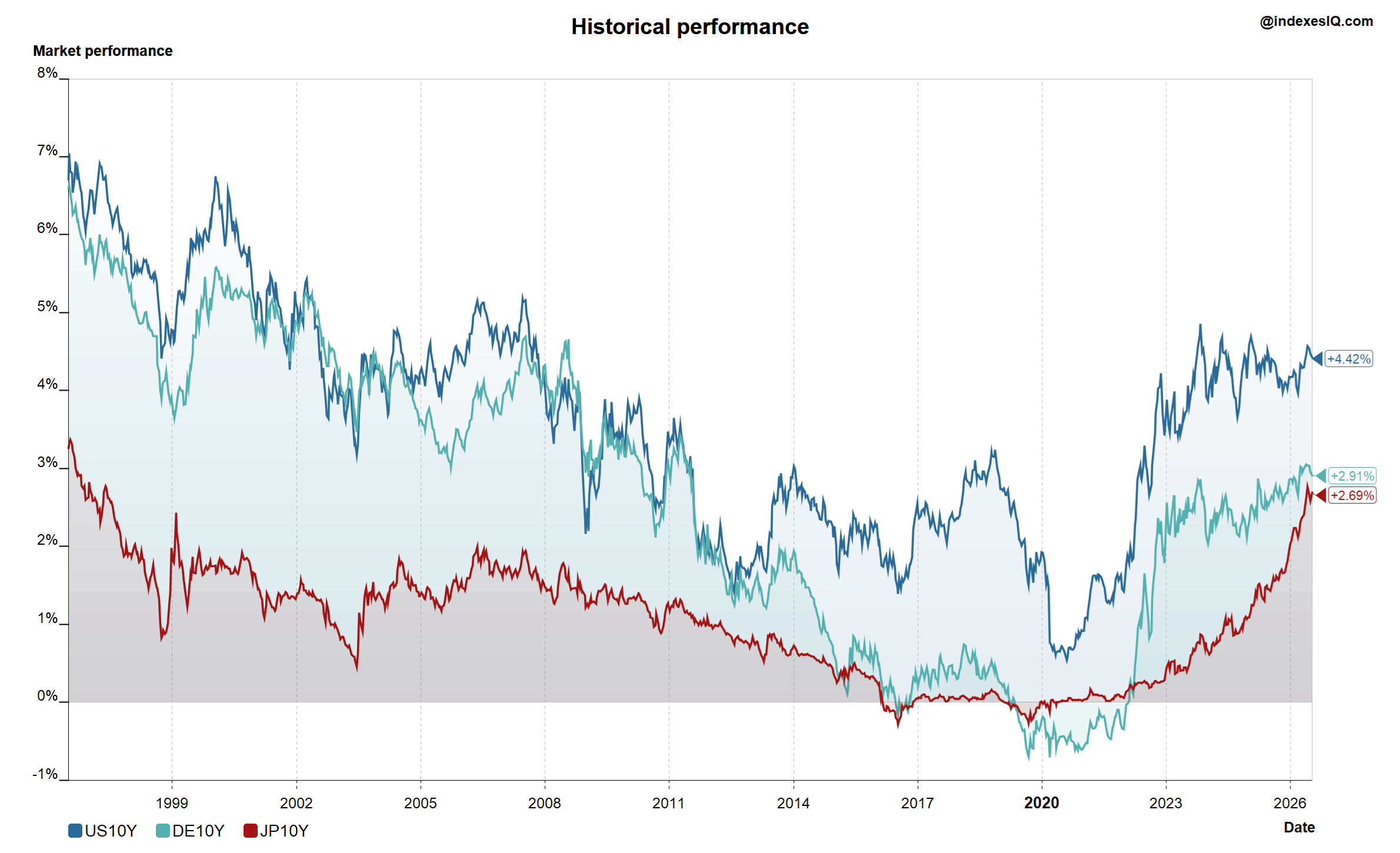
10-year government bond yields for the US, Germany and Japan, from 1990 to end of June 2026. All three fell significantly from the 1990s to 2020 before rising sharply from 2022.
A natural explanation for equity valuations rising faster than GDP is the long structural decline in interest rates. Lower discount rates mechanically justify higher present values of future earnings — a 30-year falling rate environment from the 1990s to 2020 provides a plausible fundamental rationale for rising price-to-earnings multiples across the board.
But this argument has a critical flaw. Since 2022, bond yields have risen sharply in the US, Germany and Japan — yet the ratio of market capitalisation to GDP has continued to rise and even accelerated, particularly in the US and Japan. If falling rates explained the valuation expansion, rising rates should have caused it to reverse. It did not. Whatever is driving markets above GDP growth, it is not simply the interest rate cycle.
Globalisation, Pricing Power — and Its Limits
A second argument is that large global companies have genuinely earned their premium. The Mag 7 in the US and the Granolas in Europe (GSK, Roche, ASML, Nestlé, Novartis, Novo Nordisk, L'Oréal, LVMH, AstraZeneca, SAP and Sanofi) have expanded their global reach, reduced input costs through globalisation, and built extraordinary pricing power through branding and platform dominance. Apple's ability to charge premium prices for hardware and software globally, or ASML's monopoly on EUV lithography, represents genuine economic value creation that justifies outpacing domestic GDP.
This argument carries weight — but only so far. Even Apple has a ceiling on iPhone prices. And there is a more damaging counterexample: when you run the GDP-growth adjustment for the Russell 2000 — the US small-cap index of mostly domestic companies with no global pricing power — you see the same result: market caps have outpaced GDP even for smaller, more local businesses. The valuation expansion is not confined to the global giants. It is pervasive.
So Where Does That Leave Us?
Warren Buffett and Martin Wolf may have a point. Equity market valuations — measured against GDP at a global level, adjusted for the Ireland distortion, and tested against both the interest rate and globalisation arguments — do appear elevated by historical standards. The Buffett Indicator, for all its flaws, is pointing at something real.
But the conclusion that a crash is imminent does not follow from the observation that valuations are high. Markets can remain expensive for a long time. The dot-com bubble took years to inflate beyond what anyone thought possible before it burst. And as we noted at the end of Insight #5: don't call a bubble before it bursts — unless, perhaps, you are a journalist who likes attention.
Graham's weighing machine will eventually deliver its verdict. In the meantime, the IndexesIQ app gives you the tools to track the ratio of market performance to GDP growth yourself — across any market, any time period, in any currency. The data is there. The interpretation is yours.
Equity market caps have outpaced GDP growth globally — not just in the US. The Buffett Indicator overstates the US-specific concern (the Mag 7 earn globally but are listed domestically, as Ireland's distorted GDP illustrates), but a global comparison still shows the same trend. Falling interest rates provided a plausible rationale until 2022, but yields have since risen while valuations kept climbing. Globalisation and pricing power explain part of the premium for large multinationals, but not why small-cap domestic companies show the same pattern. The concern is real. The timing of any correction is, as always, unknowable.
Jump to: Part 1 · Part 2 · Part 3 · Part 4