Chapter 2 — Indexes Heatmap
Risk, performance and correlation matrix across global equities, precious metals, currencies and treasury yields.
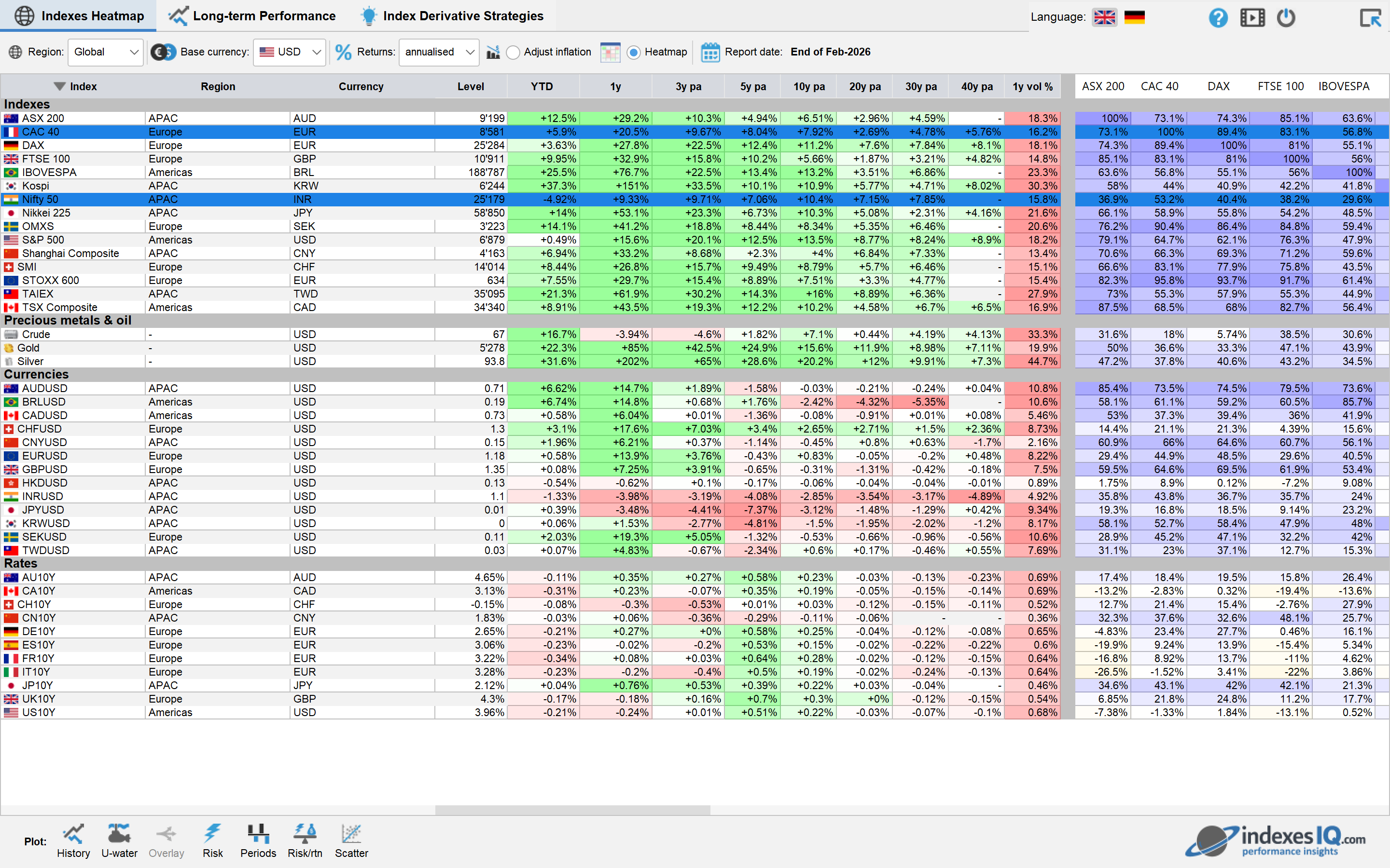
The Indexes Heatmap pane shows a table with leading global financial indexes covering equities, precious metals, currencies, and treasury yields. The columns of the table show the historical results of the performance, the volatilities and the correlation matrix between different indexes or assets. These financial results are visualised using a heatmap.
Correlation matrices of this type are widely used in institutional portfolio construction. The BIS and MSCI publish research on cross-asset correlations and their behaviour during market stress — useful background for interpreting what the heatmap shows.
Menu Bar
At the top of the table, a menu bar provides the following functions:

Region: Choose a region (Global, North America, EMEA or APAC). The selection of indexes shown in the table is adjusted accordingly. The global region shows the most important indexes globally, while the regional selection shows additional indexes relevant to the chosen region.

Base currency: You can choose between local (every index is shown in its base currency) or a specific currency; in this case, all risk and performance figures will be adjusted to this currency. For instance, if you choose the Euro as currency then the return shown for the S&P 500 will be the return of a Euro investor — i.e. it will include exchange rate risk and performance in the results table. For context on major currency pairs, see the
currencies guide.
Returns: Can be shown as cumulative returns over the respective period or annualised returns. For interest rates, the returns shown are total changes in interest rates over the respective period or changes per annum.
Adjust inflation: All returns and interest rates are adjusted for the inflation of the chosen base currency. For exchange rates, the inflation adjustment is based on the inflation difference between the two currencies. For instance, for the EURUSD exchange rate, the inflation rate of the EUR minus the inflation rate of the USD is taken into account.

Heatmap: You can hide or unhide the heatmap shown in the table.

Report date: You can choose a report date back in time — all financial results shown in the table, including the heatmap, will adjust to the chosen report date.
Selecting Indexes for Charting
You can select one or more rows in the table to plot their time series:
Once rows have been selected, the Chart type menu bar below the table is enabled with the following plot functions. All plots open in the Long-term Performance pane described in Chapter 3.
Plot the time series of the index.
Plot time series with grey zones indicating international crises or recessions.

Plot time series with peak-to-trough return analysis of bull and bear markets (defined as periods with at least ±20% returns in equity markets or ±2% absolute changes in interest rates).

Plot the time series including ‘steps’ that indicate for how long an index was going sideways.

Plot underwater chart: This chart shows the draw-down since the last all-time peak over time.
Plot overlay chart: Yearly returns including the yearly Max, Min, and most recent performance.

Plot distribution of percentage returns.

Plot histogram of period returns: Weekly, monthly, quarterly, semi-annual, yearly or bi-yearly returns, depending on the length of the time period.
Plot the risk-return diagram showing the average yearly volatility and average yearly return.

Scatter plot of historical returns of the y-axis versus the x-axis.
Once you click on one of these plot functions, the history plot will appear in the Long-term Performance pane outlined in the following chapter.
For educational purposes only. Not investment advice.