
Chapter 3 — Long-term Performance
The Long-term Performance pane enables you to look at long-term risk and performance charts. The chart type functions available in this pane have already been discussed in Chapter 2 — Indexes Heatmap.
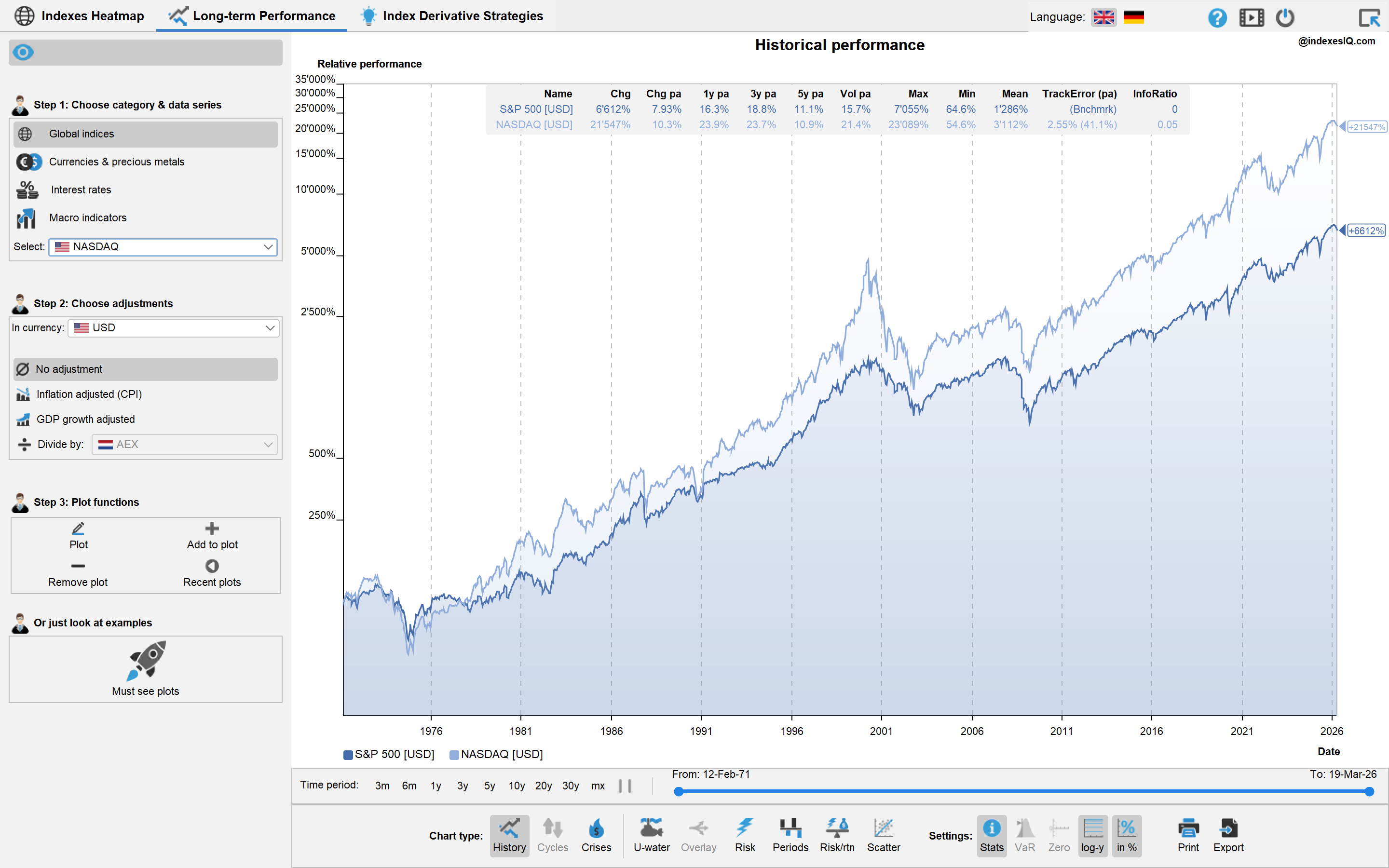
Settings Menu Bar
In addition to the chart type functions, the Settings menu bar below the plot contains the following functions to fine-tune charts:

Information: Shows a table containing statistical information of the plotted data sets.

Value-at-Risk options: Shows a pop-up menu that allows you to choose Value-at-Risk options: the time period of returns used (weekly, monthly, quarterly) and the confidence level (90%, 95% or 99%). For a conceptual explanation of VaR, see Chapter 1 of the Derivative Academy.

Show x-axis: Set the scale of the y-axis to contain the value y = 0.

Y-log: Set the y-axis to log-scale.

Percent: Set the y-axis to percentages and re-base all time series to start with 100%.

Print or export to a high-resolution PDF chart.

Export the data shown in the graph.
Left-hand Menu Bar — Adding Data Series
On the left-hand side of the plot you find a menu bar which you can hide or unhide using the  symbol. In the menu bar you can choose, add or delete time series from the plot in three steps:
Step 1 — Choose Category & Data Series

Global indices — covering equity indices, crude oil, as well as fixed-income indices measuring the cumulative return on savings accounts for different currencies.

Currencies & precious metals.
Interest rates — covering treasury yields and central bank rates.

Macro indicators — covering annual GDP growth rates, cumulative GDP growth, annual consumer price inflation, and CPI (cumulative consumer price indexes). See the IMF World Economic Outlook for global GDP and inflation data.
Step 2 — Choose Adjustments
In currency — allows you to plot a series in a different currency. For example, you can plot the S&P 500 in Euro, which means that it is adjusted for the history of the EURUSD exchange rate.
Inflation adjusted (CPI) — adjusts the time series by the CPI. For equity indexes, this means dividing the index series by the CPI of the chosen base currency. For interest rates, this means subtracting the annual inflation rate from the chosen interest rate series. For FX rates, it means adjusting the historical FX time series with the ratio of the CPI of the two currencies.

GDP growth-adjusted — calculated by dividing an equity index by the cumulative GDP growth rate of the respective country.

Vol history — calculates the historical volatility time series of the chosen series, computed over a rolling user-defined time period: 1-y, 2-y or 3-y.

Divide (or subtract) — allows you to divide one equity series by another series, or subtract an inflation rate or an interest rate from another interest rate series.

Combine — combine with another time series to form a portfolio in constant proportion. For example, you can create a 60|40 portfolio mix of two indexes. In the first menu you choose the constant proportions; in the second menu you can choose the second asset that matches the chosen currency.

Correlate — calculates the historical correlation time series of the chosen series with another series selected from the menu below, computed over a rolling user-defined time period: 1-y, 2-y or 3-y.
Step 3 — Plot Functions

Plot the chosen time series.

Add to plot — adds the chosen time series to the existing plot.

Remove plot — allows you to delete one or several of the time series shown from the plot.

Recent plots — allows you to go back to one of your previous plots.
At the bottom of the menu bar you can also look at a pre-defined set of example plots by clicking on the  symbol.
For educational purposes only. Not investment advice.